Although I shared lots of blank walls and their solutions during my Instagram “Wall Decor Weekend” last week, I still have more!
They kept coming in on Sunday and I just couldn’t keep up! Here are a few more really good ones today, that you won’t want to miss.
My blog contains affiliate links. Any purchases, at no additional charge to you, render me a small percentage, are most appreciated and make this blog possible. :-)
Blank Wall Problem #1
This is a house that the homeowner just moved into, and she has a big bare wall in the entry hall.
(That furniture there is going elsewhere, so never mind that.)
Entry Hall / Foyer needing furnishings
Entry Hall / Foyer needing furnishings
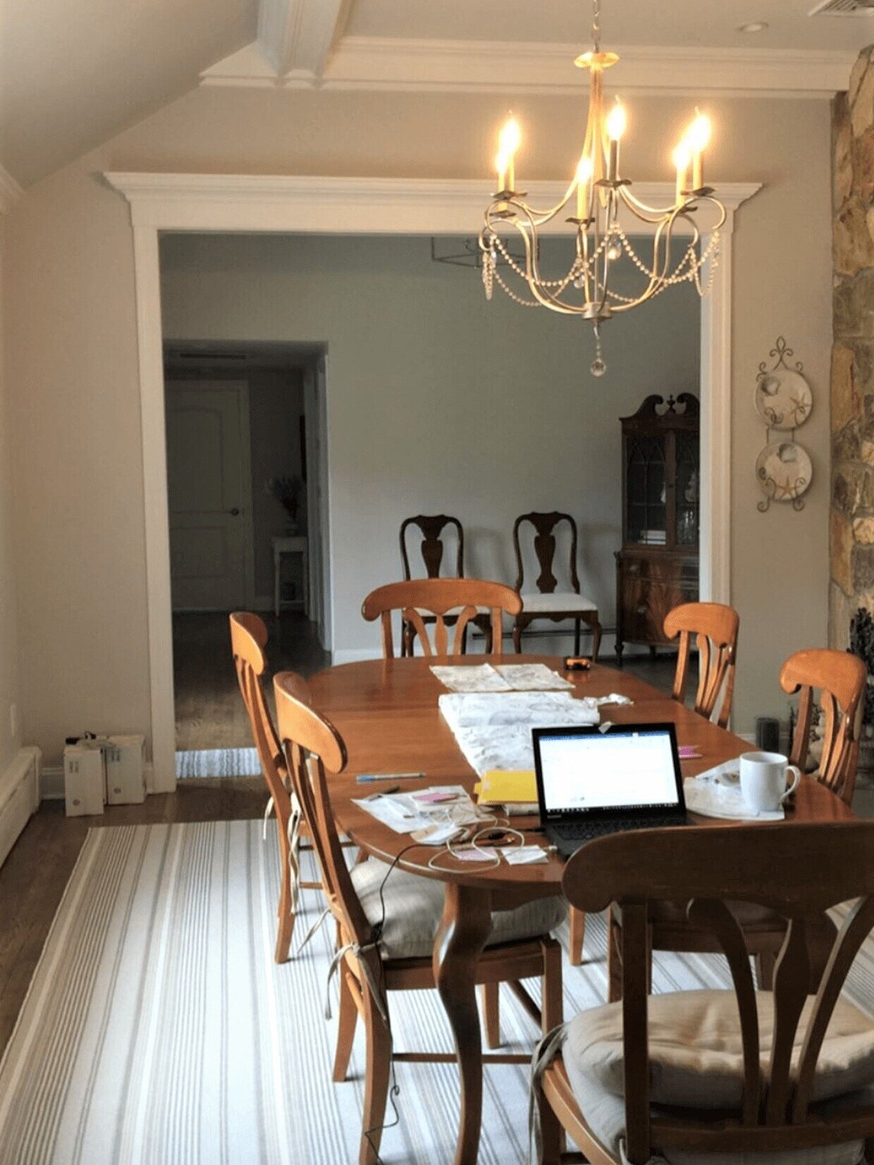
Dining room off entry hall
Family room with stone fireplace
I asked for pics of the adjacent spaces, the dining room and living room, so I could get an idea of style and color, elsewhere in the house. You can see a gray and beige color palette, in a warm, comfortable look, throughout in this lovely home.
The warm wood dominates in the dining room, but the striped rug softens the space and gives the room a more casual appearance.
I love the look and feel here and I know some perfect pieces for that entry hall.
Furnishings For The Entry Hall
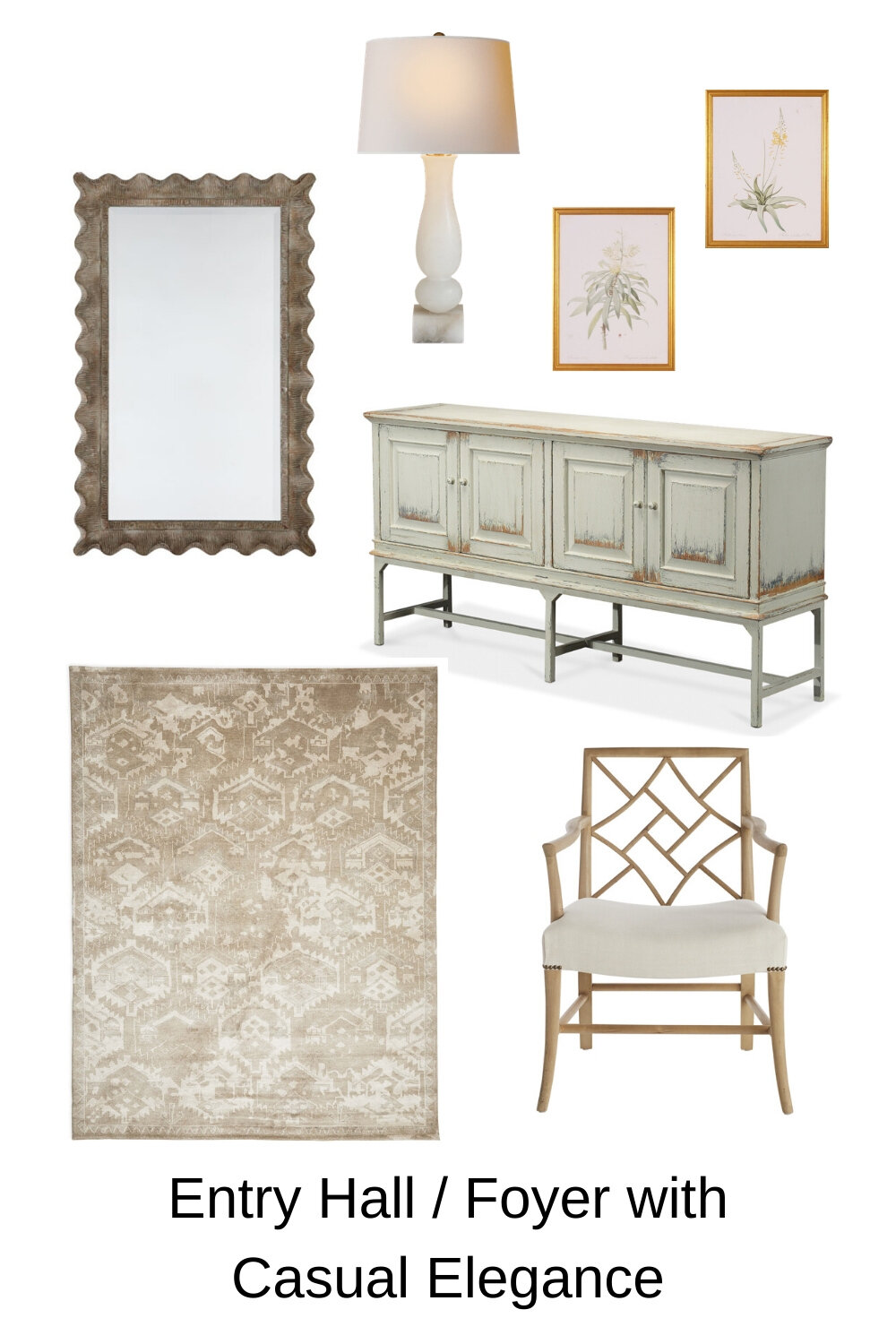
Let’s start with a large console to anchor the wall.
This console from Sarreid fits the bill for me. I like that it is a painted finish, since the adjacent dining room furniture is a wood tone. I also like the weathered look as it feels at home here, style-wise.
I’m always a fan of a mirror above a console in an entry hall. I’m thinking a natural wood finish here would be nice. I like the scalloped edge on this mirror from Wisteria.
I love the idea of two alabaster base table lamps here. They are just something really special, to add in a natural feel while still feeling a little polished.
A neutral rug adds warmth and the pattern will be good in an entry hall. I like the beige tone here since the walls are the light gray.
Lastly, an interesting wood chair on the end wall there can be a nice as a spot to fix your shoes if needed. If you have room for some kind of seating in a foyer or entry, it’s such a luxury to have. I like the natural wood tone in this one and the patterned back design.
These botanical prints, the yellow and then the green, in gilded frames would be nice stacked, above the chair.
Entry Hall / Foyer With Casual Elegance
Entry Hall / Foyer with Casual Elegance
Blank Wall problem #2
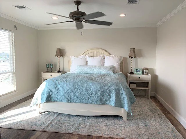
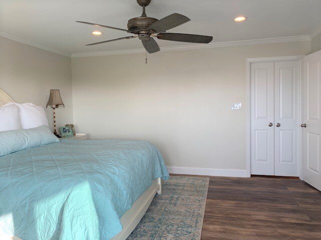
This big blank wall beside the bed was perplexing the owner of this beach house property.
A pretty blue is used in this coastal style bedroom. The homeowner wanted to know what to do with the blank wall beside the bed.
Blank wall beside the bed in this coastal style bedroom had this homeowner stumped.
I think one large art piece here would help cover that wall and work with the blue color in the pretty bedding and rug.
And priced well from Pottery Barn, it works!
She wanted to get two new lamps too. These chunky cream ceramic lamps, also from PB, would work great.
This 5’ wide piece of art from Pottery Barn would look great in a coastal style bedroom and take up a wide wall space.
The perfect milky, chunky lamp for bedside tables in a coastal bedroom.
Blank Wall Problem #3
This last wall decor dilemma today, comes all the way from Switzerland!
I love how this homeowner has created such a warm, livable home within a more contemporary envelope. The fireplace is fab and they have such a nice collection of art, books, and memorabilia.
She wanted to know what to do about this space above the piano and the space on the other side that is more narrow.
Here are the pics she sent.
What to do here on the blank wall above the wood upright piano?
The modern look fireplace has some very appealing asymmetry and another, smaller niche on the other side.
View of the whole living room with bookshelves and seating.
For the wall space in the piano niche, I think having something large there that fits that whole space, as opposed to being centered over the piano, would be best.
She’s got lots of good asymmetry going on already on that wall, so I didn’t really want to see that wall niche space treated with even more of it. I wanted that area to have a more overall look to the art on the wall.
I really like the idea of black and white photographs or prints, so as not to compete with the color in the piece over the fireplace. We want that to dominate here and for this piano niche to recede slightly.
I also like the idea of doing a chrome boom arm style floor lamp, rather than the more traditional style that is there now.
I think the black and white graphic style of the art and the chrome floor lamp will be a nice modern mix with the more traditionally styled chair and wood tone piano.
The niche to the left of the fireplace is filled with large black and white framed photographs, a carved wood chair, wood tone upright piano, and a chrome boom arm floor lamp.
For the opposite side of that fireplace, there is a smaller niche where the homeowner was thinking of putting some floating wood shelves.
Here’s how that would look. It looks nice and fits perfectly.
Niche to the right of this contemporary fireplace is filled with floating wood shelving and small stools below.
To be honest though, although it all fits, I think it’s a little too crowded with stuff. Especially with the full wall of shelving over on the opposite wall, I think these would be a little overkill.
I actually prefer a clean, open look here in this corner. I’d move the existing traditional floor lamp over here and get a big basket with some sticks to fill that space.
I like the white space on the wall area here. I think it creates a nice balance.
I like this niche on the right side of the fireplace filled a little more simply, with the existing floor lamp and a basket with sticks.
I loved seeing these rooms of some of my readers and Instagram followers!
I’ve compiled all these different wall decorating dilemmas into a comprehensive book! This is a guide that you will use for years to come, whenever confronted with a blank wall you don’t know what to do with!


