I've got a kitchen / family room project that is nearing the end of construction.
Well, almost.
They're in the midst of paint right now and still have backsplash tile, flooring and then all the finishing touches, the final electrical, cabinet door hardware, lighting, appliances, etc., to be done.
This project leans to a mid-century modern style, with some global folk art from this homeowner's travels highlighted, along with some attention to natural materials. All this in a traditional suburban home was a bit of a challenge, but I know it will all come together in the end.
As I said, we are in the home stretch. We're finalizing some of the last furnishings items now. This was a kitchen/open-family-room space, and really needed to flow well together.
Here's how the kitchen looked before.
Before Kitchen Remodel
We're doing things that I love to do in kitchens that made a big difference in updating.
- We are eliminating the desk in the kitchen and adding a small telephone/charging niche instead.
- We are building in a microwave drawer to get that undercounter.
- We're doing a new range that has the oven in it, so no need for wall ovens anymore.
- We're moving the refrigerator, as this location was really cramped on that short end wall and rendered that corner basically unusable.
- And yes, we took those kitchen cabinets to the ceiling. :-)
All of those design features are going to render a more useful kitchen with more usable counter space.
Here's how the kitchen is looking now, below, primed and ready for paint. We went with a rather clean style cabinet design, not wanting to go too much into the mid-century vibe with the kitchen cabinetry. We're saving that more for the furnishings.
Remodel under construction - cabinetry primed
The niche is on the end of the cabinet run, refrigerator is moved, we have an undercounter microwave on the short end wall and the range as the focal point of the kitchen. (Although you can't see it in this shot above, it's behind the column.)
While I would have loved to eliminate those columns and build a big, lower island, it was just way too costly here. Instead, we paneled them and now they look intentional, don't they?
My hope, in finishing them the same way we are the cabinetry, was that they will visually blend in, when you are in the family room looking into the kitchen, and not stand out as a barrier in this space. Previously, they looked spindly and had an awkward transition at the top of the column.
BEFORE - Awkward transition of column at ceiling
We ditched that curvy crown moulding in the space too.
The homeowner purchased some vintage pieces before the project started, and we are working with those, reupholstering the sofa, etc., filling in with some new modern-look pieces that will complete the design. :-)
We are looking for items that don't break the bank. We splurged on some parts of the remodel, so we have to balance things out a bit.
Just to share one of the splurges here, this beautiful slab of special quartzite is being used for the kitchen counters. We were looking for a medium gray, durable natural stone that wasn't busy.
Allure quartzite slabs from Allied Stone
This natural stone, a quartzite, is one of those few that is super dense and durable. It has a fabulous leather finish so you can ever-so-slightly feel the texture of the stone. It's really perfect for this project and homeowner, who really wanted a statement natural stone product.
Ann Sacks Yakisugi Field Tile in 48" planks
It relates in color and value to our interesting Ann Sacks linear tile that will be applied to the fireplace. The more modern style on this wall helps to turn this home away from the traditional and into something cleaner lined and more modern.
The tile is designed to imitate a Shou Sugi Ban or charred wood look. I can't wait to see it installed with it's walnut mantel. Gray and orange toned wood look great together, as I share in this post.
Here was the before pic, below, a very traditional mantel design with ordinary tile surround. The tv openings in the wall are super deep, a throwback to those deep televisions we all had, of course. You can see that the few items the homeowner had displayed in there were basically lost in the deep, dark hole.
BEFORE - Fireplace wall with deep, outdated niche for tv
And yes, that Harry Bertoia chair will be staying!
SW Gauntlet Gray
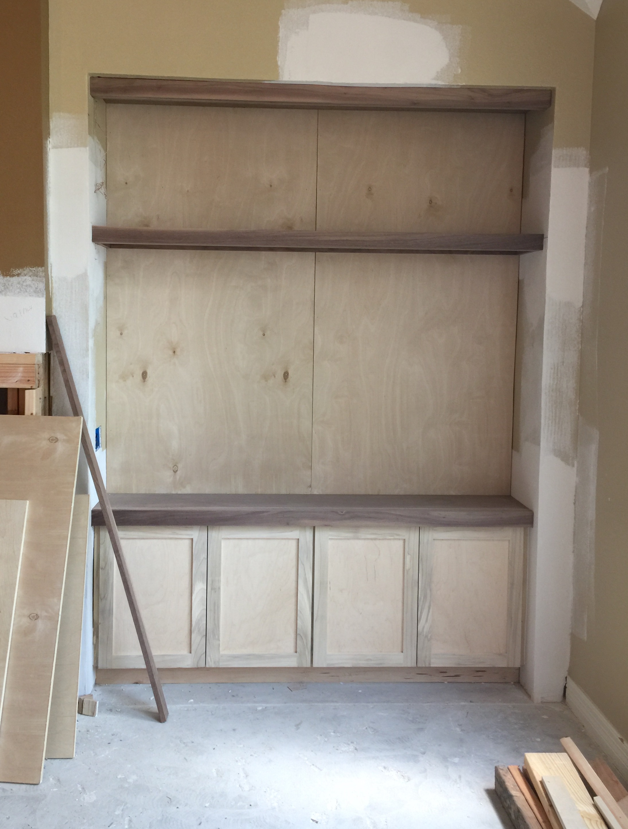
I'm super excited about the tv built-in, the new cabinetry here will be painted a gray to match the tile with strips of walnut bringing in a hint of natural material and the color of the floor. Walnut will top the fp mantel too.
I love that it will be this gray, SW Gauntlet Gray, which is a nice backdrop for a black tv screen. Dark colors behind a television help a screen blend in and not stand out with such high contrast.
See the cabinet under construction below. Love those strips of walnut, they'll look great against the Gauntlet Gray painted plywood back.
So, back to the mid-century style furniture.
The homeowners found a really interesting, extra long, vintage sofa with a slight curve to it. Today, I'm just using this one as a stand in, to sort of imitate style for you.
Here's the furniture layout.
Furniture Layout
We're reupholstering the sofa in a gray chenille. You can see that, again, we will repeat the color in the fp tile, the countertops, and then the sofa, for a nice neutral statement on these big elements.
Walls, trim, and kitchen cabinets are all SW Aesthetic White, to lighten and brighten the home overall. They were tired of all the earth tones they had been living with.
We have a warm wood floor throughout this space, so that will be a dominant color and is very indicative of the woods used in furniture during the mid-century period.
The homeowner likes oranges, peacock blues, and other mid-century type colors that might come to mind.
Here is a recliner that I proposed that might work well with their sofa. It's on legs, has a squared off shape, and I like the high back and cushioned arms. This is from Lee and it comes in lots of different leathers but this one looks like a vintage color to me and might work well.
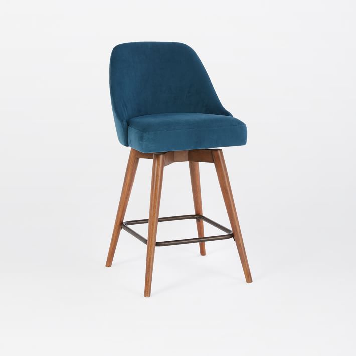
Next are barstools. Because we need three, we don't want to overspend here and luckily found something very appropriate at West Elm. I like the peacock color choice.
Here are the rug options....I know, finally got to the point. :-)
These are all available online and luckily most have swatches you can order. I was looking for something that would incorporate our color scheme, be rather large scaled and graphic. I feel like we need to make a style statement here and I think these would all hit the mark.
Here's what I chose for us to sample along with some of the furniture pieces we were looking at.
The jute one is so well priced I couldn't NOT show it. That one and the gray wool have more of the "global folk art" vibe which could work really well. I also like the overdyed rug for a bigger color statement. I feel like we've almost gone far enough into the mid-century look with the furniture and now need to layer something more.
The samples that the homeowner liked arrived this week, and we compared.
For this rug, we started with a process of elimination.
- I loved the bottom left, but the gray of the sofa wasn't working with the gray in the rug.
- The upper right was a little too earth-tone to me.
- The bottom right was just so "new" looking with the cut pile all the same texture and overall the small pattern made it seem busy.
- The family room is a two story space, open to the balcony/game room above, so I wanted a dynamic larger scaled pattern on the floor as you are looking down. I think the top left fits the bill.
It has a larger scaled pattern, an interesting mix of cut and loop pile, the colors work, and the subtlety of the pattern won't dominate the room. It'll be just the right backdrop for these mod furnishings.
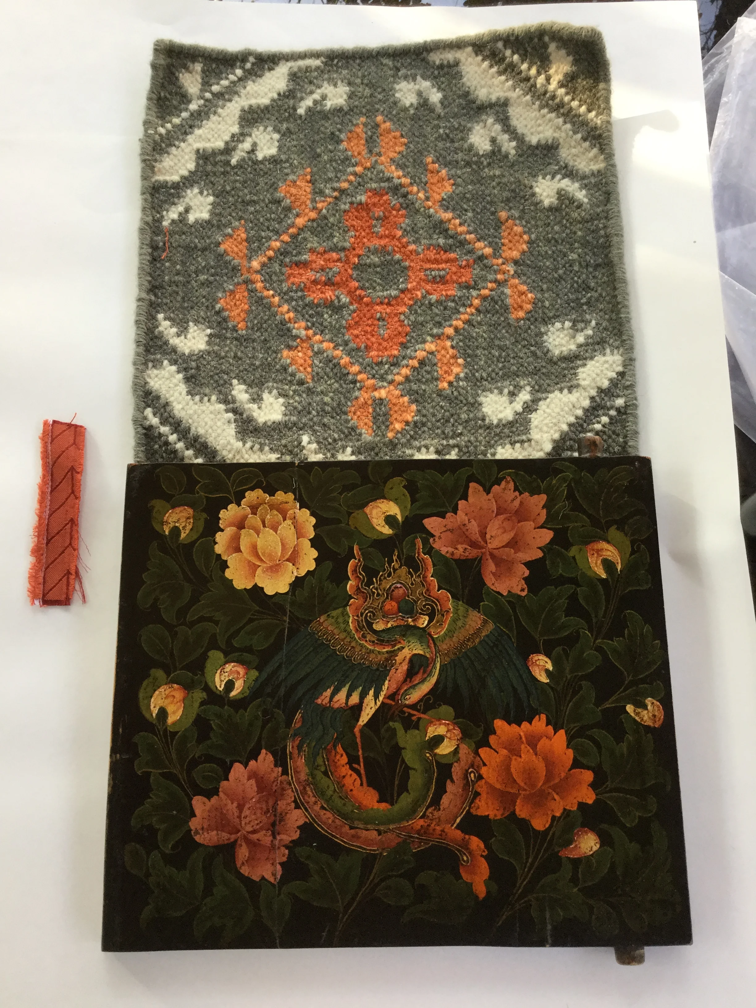
It also looks amazing with a fabric we were looking at for the breakfast room chairs and the pattern even works with the shade fabric we're using, a pattern with kind of wonky angles and diamond shapes. I love repeating a design element in a space to create a stronger style statement.
Best of all, we are going with the lower left for a smaller entry hall rug. It'll be perfect there since now we're going with this bright orange fabric on the dining chair upholstery and her cool Asian cabinet in the entry hall. :-)
Here are my top picks for some mid-century modern style using some of the items we chose.
Subscribe below if you want to get my FREE Top 5 Bookshelf Styling Tips and receive all kinds of tips, advice, and design goodness directly to your inbox, twice a week.


