Las Vegas Market 2014! I was there!
There was so much to see. And so much to report! (Didn’t want to let you down; if I promise to provide “real-time coverage” I’m going to provide “real-time coverage! ;-)
My feet! Walking the show during the day and Vegas at night! Everyone complains about that, don't they? While I didn't make even close to most of the showrooms, I did hit the ones that I felt would be appealing to all of you and help me with my business. There was lots of gorgeousness at every corner.
Last night, as I scrolled through everything I shared...
I found myself reflecting back on all of the design trends I saw and heard about at the show. I’d be doing myself a disservice if I didn’t take a moment to take some inventory because, after all…
Designers are the conductors of the symphony, we don’t write the music!
We design using products available to design with. Textiles, furniture pieces, lighting, rugs, etc. — they all go into a unique mix for each client. By making sure we’re aware of everything that’s available and knowing how to access all of it for our clients, we position ourselves to be able to do our jobs at the best of our abilities.
So what are my impressions of everything I saw? Well...
Here are my top 5 takeaways from Las Vegas Market 2014:
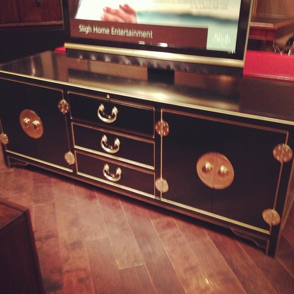
1. Brass and gold are here to stay.
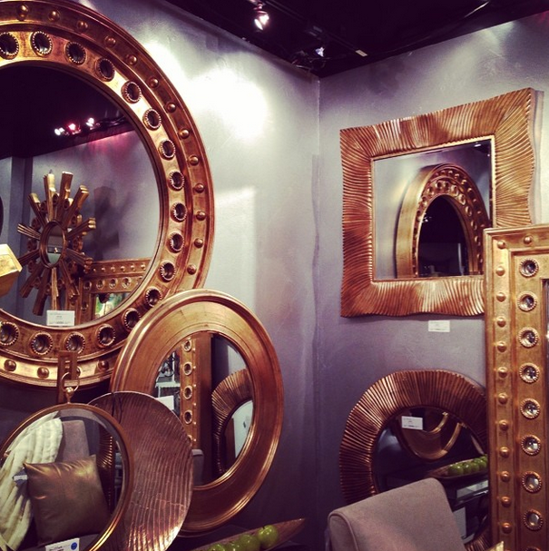
It’s on lighting, accessories, art, furniture hardware, details: brass and gold. Everywhere I looked, there it was. I realize this isn’t exactly new news to those of you in the know, but it still must be said: Brass is definitely back, and it’s not going anywhere any time soon.
2. Painted furniture is HOT.
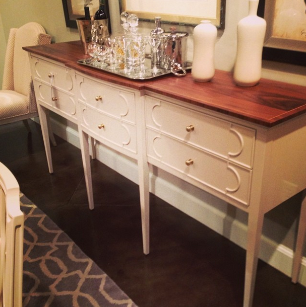
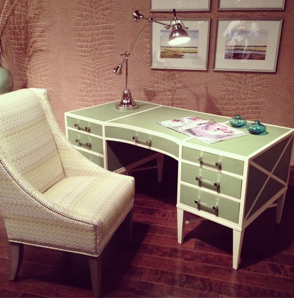
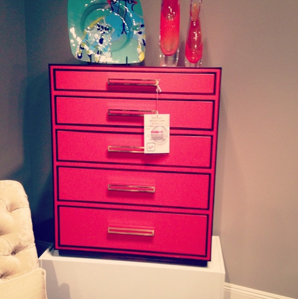
From a rustic/chic style with a weathered finish to a slick lacquer, painted pieces were everywhere. I especially loved Stanley Furniture’s mix of painted pieces with natural walnut tops.
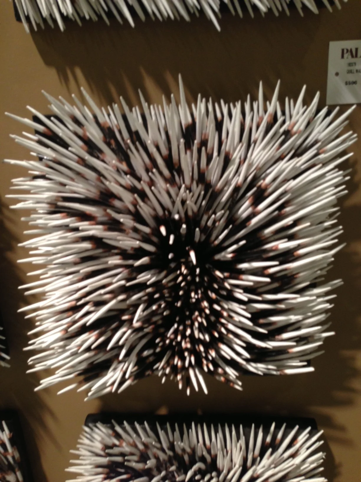
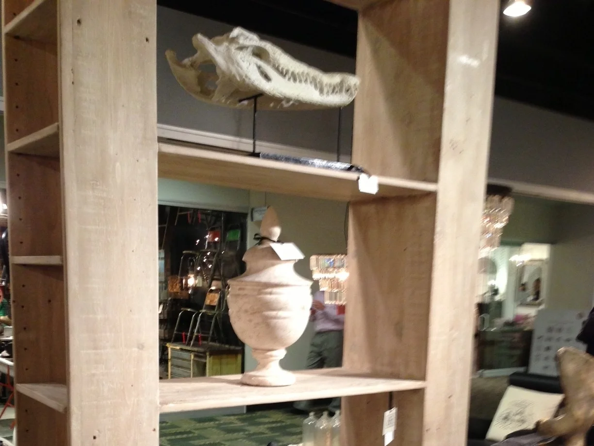
3. Natural, textural elements are king.
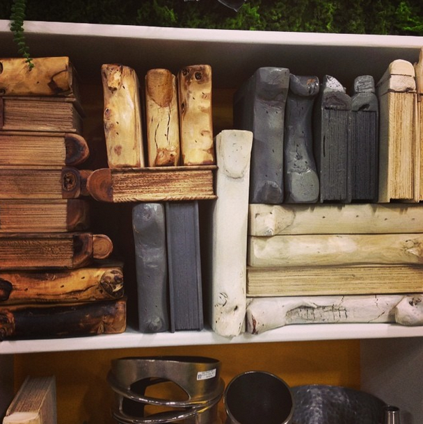
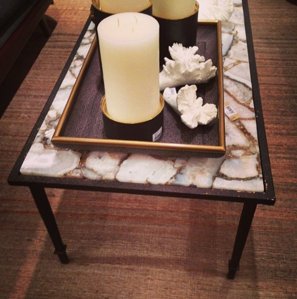
Bone inlay; petrified wood; agate; books carved out of wood, (even porcupine quills), rope was covering all kinds of furniture and decor! And it wasn’t all brown either. Lots of these natural elements have a high contrast of black and white too.
4. Shapely pieces add interest.
It seems like we all think “color” before all else; and that’s not surprising, because color is the most eye-catching of all the elements of design. Yes, it’s scientifically true: your eye sees color before it sees anything else. However... It’s hard for me to ignore that I’m being drawn to the shape of a piece a lot more often as of late. Why? Because shape can add nuance and a distinctive layer to a design. See pieces in the slideshow; their shapeliness will bring grace and style to any interior.
5. Playing with scale is on-trend!
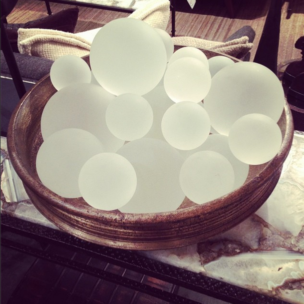
Overscaled accessories, lighting, artwork, etc. — they all make bold statements in an interior. Because customization and personalization of your home is truly on fire now, making a larger than life statement is dynamic and eye-catching. My advice: Find a few pieces to go big with in your home for some drama.
However, on the other hand, finding the perfect place for detail — something exact, small, distinctive — can make an equally impressive moment, like these tiny tables from Interlude:

