I continue to get questions about where to end backsplashes all the time and today, I’m sharing some recent dilemmas that have come through on my blog.
Yes, we’ve seen these types of dilemmas here before. If you’ve been reading my blog for awhile or if you have my Backsplash Bible, you likely know what my recs will be before I share them. ;-)
Let’s take a look.
Backsplash Dilemma 1
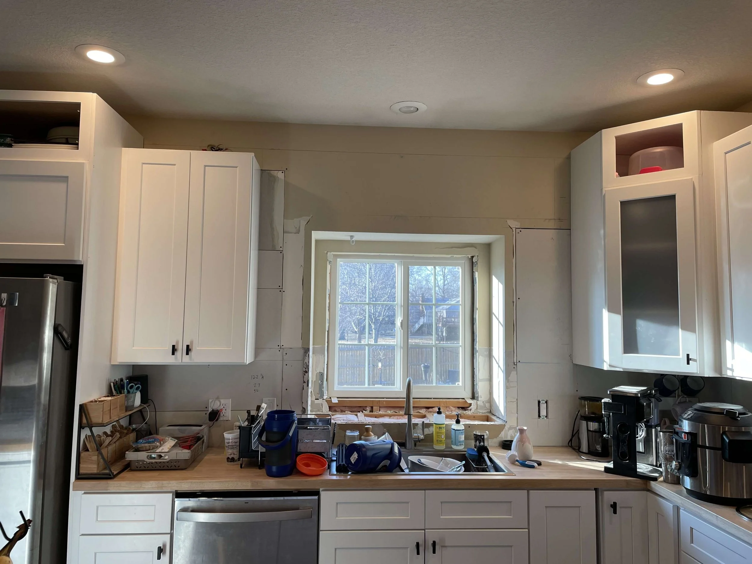
Should we tile the whole wall?
No.
I love tiling the whole wall normally, but with a kitchen like this, upper-cabinet-heavy, I think it is overkill.
Even though you have a big gap up there above your cabinets and you would see the tile from a distance, I feel like you are just wasting your money. If it were me, I’d take that money and invest in additional cabinet boxes on top of the ones you have to make cabinets to the ceiling.
That would give you a more upgraded look.
If you don’t want to do that, then just end the splash at the underside of the hood and then align it on the end where the microwave is with the bottom of the microwave.
You have lots of upper cabinets and tiling above and below them here will not give you the “wall of tile” look you might be after.
For that look to be successful, you would need to get rid of a few of the uppers, like the ones on each side of the hood, to make that space feel more open. That, combined with the cabinets to the ceiling, would give you a “wall of tile” look and create a more custom and special elevation.
Honestly, I’d get all new uppers on that wall and put the microwave into the base cabinets as a drawer unit. I would also consider a cabinet around the fridge.
Not to add a lot of money to your remodel here, but I wouldn’t spend money on a design element, like tiling the whole wall, that won’t really get you the look you desire.
Backsplash Dilemma 2
Where do I end a backsplash at a peninsula?
I do not care for backsplashes floating in mid-air like the way it is taped out in the pic, so I typically align the splash with the bottom of the upper cabinet to the countertop, so that it stops with the upper cabinet.
That will leave better space for art on that wall at the peninsula.
Backsplash Dilemma 3
Where should tile go around this recessed window?
You can’t go the ceiling with this tile because your cabinet on the left doesn’t go all the way up. The one on the right might, after it gets a crown moulding, but both sides won’t look the same.
(That’s a good reason to have elevation drawings done so you can see things like this and plan them out before you get the cabinets installed.)
Therefore, I would keep the splash low here, at the 18” high level.
So, if it is coming into the recessed area at 18” high and you are doing like a slab material on the deep sill there, then I would add wood trim around the face of the window in that recess. Just a flat piece of wood is fine.
The tile backsplash then travels into the recess at the 18” height and dies into the wood trim on the back surface.
Here’s the detail.
Sketch of tile backsplash detail at recessed window. carlaaston.com
Backsplash Dilemma 4
Where should the backsplash end with upper and lower cabinets?
This person really wants to align his backsplash with the edge of the countertop overhang. Then he wants to pull the upper cabinets over to align with that.
I think this will look top-heavy and like the lowers weren’t made wide enough.
I usually only align backsplashes with the edge of the countertop when there are no upper cabinets.
In this situation, I would align the upper and lower cabinets (like they should) and then adjust the slab backsplash to that it aligns with the sides of the upper cabinet.
It will not look funny, people!!! I promise! :-)
Backsplash Dilemma 5
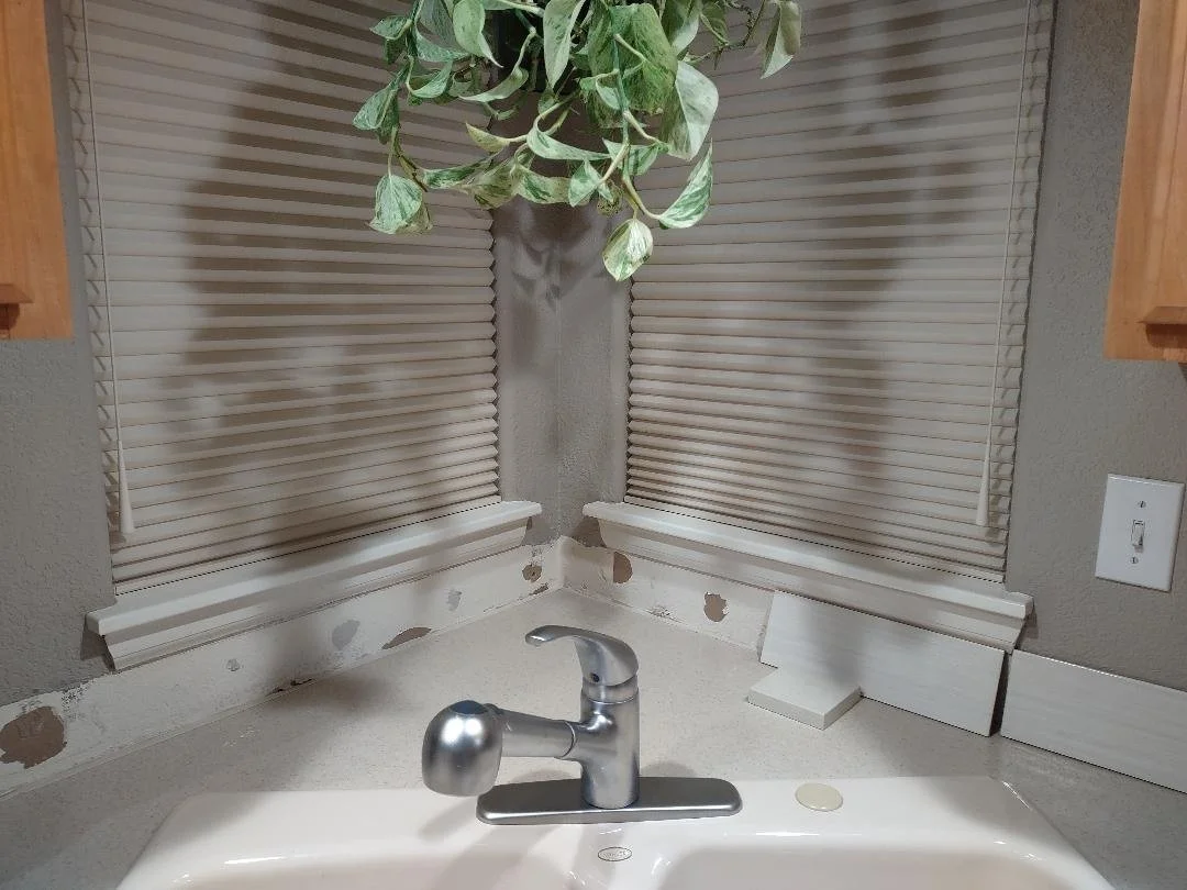
How should I tile up to this corner window situation at my sink?
Corner window at sink
How to run the backplash into the window at the corner sink?
First of all, get rid of the apron (that piece of wood trim) under the sill. If you are tiling under a window, you do not leave that apron there, you tile up to the sill.
I can’t see if the cabinets go to the ceiling or not, so I can’t recommend taking the tile up the wall there.
This is what I would always prefer, pictured below, a fully tiled area around a corner sink situation. And I love how the window is framed out with a simple casing, in the project if mine.
However, everyone has different scenarios and you can’t always do this. In this project, the cabinet on the left went to the ceiling and we tiled the whole wall on the right since we had open shelves.
Corner window with tile backsplash and slab sill. Carla Aston, Designer
Here’s how I’d detail that with a backsplash that was 18” high, that went up to the bottom of upper cabinets.
Detail sketch of how window should have casing or trim for the backsplash tile to butt into. carlaaston.com
Backsplash Dilemma 6
How do I protect the side wall with my range sitting right there against it?
Stove against the wall - side backsplash?
Oh, I feel bad for people who have this situation because not having a countertop on both sides of a cooktop is not ideal at all. This happens a lot in apartments or small homes because there is just no other option.
And I get this question a lot, because there are so many kitchen layouts like this.
Let’s face it, that side wall is going to get dirty. And there will likely be some spills down that side of the range, if you cook at all. This is a tight space and when the marinara gets bubbling, there will be splash.
Although I absolutely detest a side backsplash when it is not needed, I think this homeowner would need one here.
I don’t however, like a backsplash that just floats there on the wall. If you are going to do a splash up by the cooktop on that side wall, chances are it will drip down the wall too.
When this scenario occurs, I’d remove the baseboard on that side wall just to the front of the stove, and tile from the bottom of the microwave to the floor. Yes, it will not be great, but it will be easy to clean and you will be glad you did the whole side wall there rather than just have it as a band of tile floating on the side wall.
Backsplash at range that sits against a wall on the side. carlaaston.com
Keep your tile choice simple and plain looking, not something eye-catching.
I would probably just use some white subway tile here and there are bullnose edged tiles or jolly pieces you can use to edge the top and along the side, so the tile doesn’t look unfinished.
Here are some white subway tile bullnose edge pieces from Home Depot. They even have a corner piece so you could make that outside corner.
This is a jolly tile trimpiece. I’ve also seen it referred to as a demi-bullnose. It handles the outside corners of a tile installation.
BTW, if you edge your tile with edge pieces like this (if you aren’t making transitions on inside corners like I prefer) you will be way ahead of production home builders.
They typically tile with no edging. (And it looks so unfinished! #petpeeve)
Backsplash Dilemma 7
How should I tile an area with open shelves?
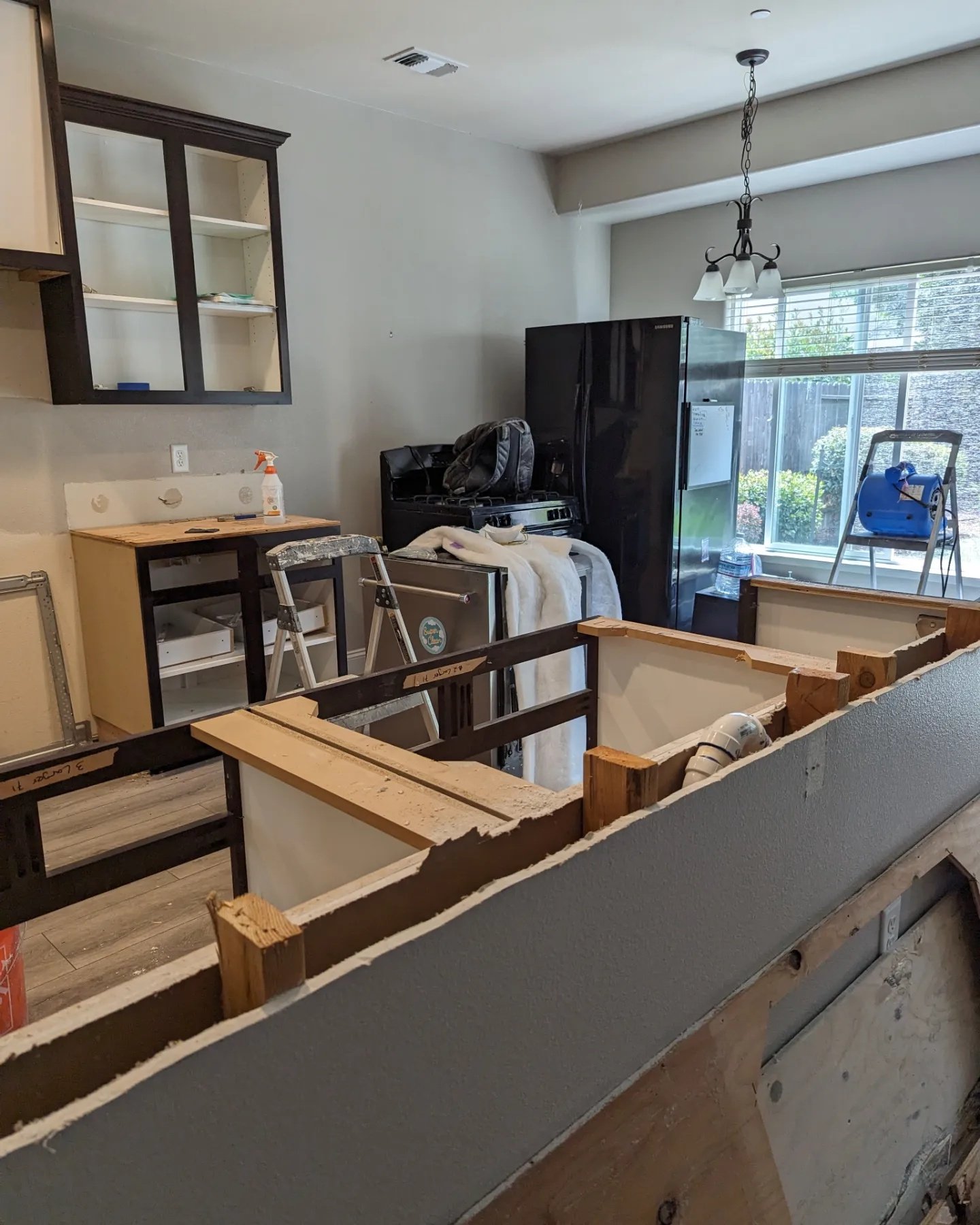
Kitchen during remodel where base cabinets will extend along wall.
Wider view of long wall to get added base cabinetry.
This homeowner is in the midst of a remodel and is planning on carrying the base cabinets on down the wall there to the window wall.
They will do open shelves above the base cabinets in this area and they want to know if they should continue the 18” high backsplash there.
I do like the idea of continuing the cabinet across. I wish they had upper cabinets to the ceiling, as I would then have them do a wall of tile and install the shelves on top.
But, they can just stop the tile at the upper cabinets and have painted sheetrock at the open shelving area.
In this kitchen remodel, we decided that tile on this wall with the open shelves would be overkill. Plus we had a lovely paint color that matched the tile in the kitchen and it was nice and finished without the tile.
Kitchen with open shelving at the breakfast area. Carla Aston, Designer
I’m not too keen on a tile backsplash up to 18” here, unless they are doing a shelf that spans the length of the wall, butting from cabinet side to window wall.
In Option A, the area with open shelves feels more like breakfast room space. Because the wall elevation is more open and doesn’t have full cabinets, the space feels like a different room.
In Option B, the space feels more like an extension of the kitchen, with shelving that is more anchored and seems more permanent. The continuous backsplash works fine running across the wall.
I prefer Option A, but it depends on what the homeowner would prefer here. I do think Option B works.
My least favorite here is Option C.
These shelves could be with or without brackets, it still feels a little awkward to me.
It feels like it is not really designed thoughtfully with all the details in mind. They don’t really need a backsplash as there is no water or grease that will be splashed.
I also feel like open, floating shelves should just be “floating shelves” and not visually anchored to a material that is only below it. I rather like the wall being the same all around and behind the open shelving.
It’s okay, but I would likely not recommend Option C.
Do you see one thing some of these images have in common?
They are in the middle of a remodel and have reached a stumbling block. They have a decision to make and don’t know what would be best.
You also might notice that while they all think their question is about the backsplash, the solutions almost all conclude that a better design option might mean addressing other details like window trim, window sills, even cabinetry.
That’s why I’m here, to help people along the way and even BEFORE things get this far along with my Kitchen Design Guide. :-)


