You won’t believe the before and afters of this kitchen remodel today. I’m so happy to say I had a small hand in the design, but these homeowners were the real champs here.
After our Designed in a Click session, they went for it in a big way and made some major changes that rendered them remarkable results.
The before images look a little hopeless, they obviously had a lot of work to do, but they saw the potential in their home.
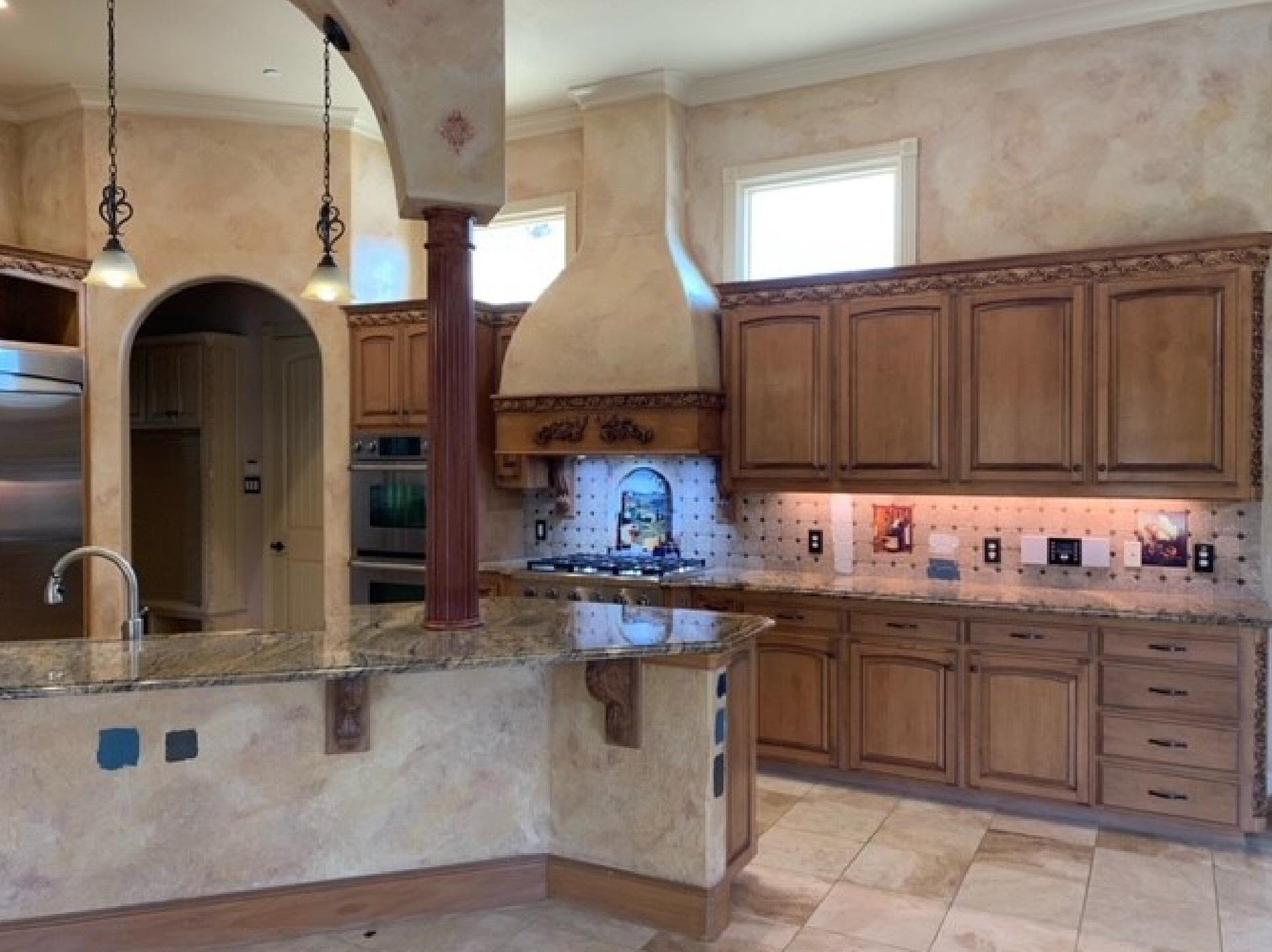
Oh yes, they had a lot of Tuscan going on there.
Faux finishes
Big corbel brackets
Decorative “grape” themed cabinet onlays
Scenic painted tile backsplash
Arches with columns
Speckled granite
The “dot” tile backsplash
Travertine tile floor
Curly iron pendants with gold toned frosted glass
BEFORE REMODEL - Tuscan Kitchen
BEFORE REMODEL - Tuscan kitchen with ornate hood and faux finishing
When we did our consultation, they were trying to go with a more minimal remodel. I did suggest ways to do it partially, but they ended up going all in and using the overall recommendations but with everything new.
They wanted to replace the hood with something like this but had questions about their ceiling height, etc.
Type of hood desired for the new kitchen.
They wanted a different backsplash but were going to keep the countertop and floor. They were asking about taking the backsplash to the ceiling.
They were also wanting to remove the grape leaf appliqué mouldings and paint the existing cabinets a white shade, doing the lowers and/or island in a navy blue of some kind.
They were considering getting rid of the arch and column too.
You can see that working with all these elements would probably be more difficult of a design problem than tearing out and going in all new.
I felt that cooking wall look could be dramatically improved to really highlight a new hood with some cabinet changes. And finding just the right finishes to update this kitchen to a white look while reusing the counters and floor would be hard. Trust me!
Of course, it would be a lot more money, but it would be more of a sure fire result than patching and piecing all this together to make it look totally fresh.
Here’s what I suggested:
I liked the idea of the hood and didn’t see any problem with taking something like this all the way to their ceiling. Vent-a-hood is a good option for hoods like this and I made some recommendations there.
I did see a problem with taking the backsplash to the ceiling with their cabinets as is.
I would not take the tile up past the hood, since you have short upper cabinets (relative to your ceiling ht). You would have an awkward transition of material above the top of the cabinets if you took it up further.
Here was my rec about the countertop/paint/backspslash selections.
If I were you, I'd really push to redo the countertops with this change. Going with a blue lower cabinet and white uppers, which I like, will make your existing countertop look out of place, in my opinion.
I would hate to see you make selections of backsplash based on keeping that counter when at some point, you want to change it. If you were keeping an earthy toned look or doing really creamy whites, I would think more about keeping the counters, but with the brighter white you have noted, below, and your blue on the lowers, I think you should bite the bullet and do the counters.
Here’s what I included in the recommendations after I answered her questions.
I'm making further suggestions, below, if you had a big budget and ever decided to go all in. :-)
The one thing that bugs me most about your hood wall is the tiny cabinet beside the hood. It looks so crowded and the other side then looks almost too wide. The proportions are odd, although I do understand the hood between the two upper windows.
Get a 48" range in lieu of the cooktop and get rid of the oven tower on left. These ranges can have 2 ovens, a regular size and then a smaller, but they save so much space in a kitchen overall.
Remove all the upper cabinets on that wall.
Add a full height upper cabinet on the end of the cabinet run, to stop the backsplash and take advantage of your nice high ceilings. It will make up for some loss of upper cabinet storage.
There is ample room for a nice new hood and some statement tile on the backsplash that NOW can go to the ceiling.
Do a cabinet to the ceiling then on the other wall, at the fridge, to reflect that new look.
Panel the front and ends of the bar area and use steel brackets that are not seen, under the bar countertop when you redo the counters. No need for the corbels anymore.
My sketch showing how to handle the hood wall and island. I really love this option as the windows feel much more part of the design and enhance the hood now. They don’t feel like an afterthought of a way to just get extra light into the kitchen. carlaaston.com
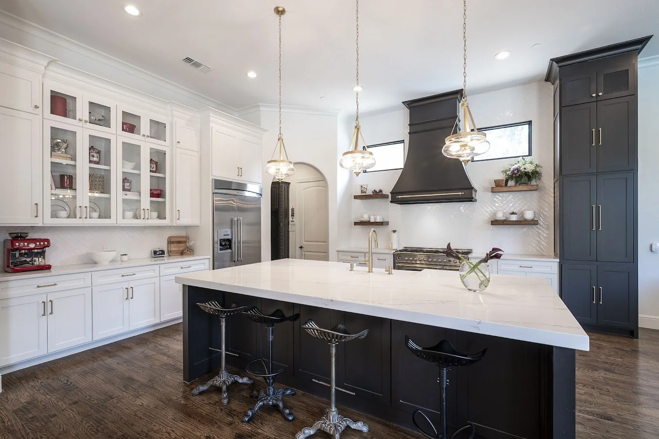
AFTER - THE REVEAL!
They did go big on the remodel, even getting new flooring and new cabinets. I love the new rectangular island too. They couldn’t have done a different footprint like that easily if they still had the existing travertine floor.
AFTER REMODEL - No more brown Tuscan kitchen!
AFTER REMODEL - No more brown Tuscan kitchen! Love the tile to the ceiling, the new hood and the spacious look of no upper cabinets here.
AFTER REMODEL - No more brown Tuscan kitchen!
AFTER REMODEL - No more brown Tuscan kitchen! Getting rid of the arch and columns at the island was a game changer.
Would you ever believe that Tuscan look home in the top image of this post could ever look like this? :-)
They did a great job along with their contractor too!
I just love to see the after pics.
If you have a project I’ve helped you with in a consultation or Q and A that you have some good “after” pics to share, we’d all love to see them. Send them HERE.
Get some help with your project!
And if you need a little help or some nudging to look beyond your own ideas…..I can help, with my Designed in a Click consultation service.
I have my handy Kitchen Design Guide for sale now that can help you along at your own pace with your next kitchen project.
Subscribe to my blog for more posts like this sent right to your inbox.
Pin this image below to Pinterest to help me share this amazing remodel. :-)
This blogpost was thoughtfully written by me, Carla Aston, and not by AI, ghostwriters, or guest posters.


