I recently did an online consultation for a homeowner who was frustrated with her long wall view from the kitchen. She felt like the wall looked very hodge-podge and she wanted to pull it together.
She also had a few questions about the entry hall mirror, the art she placed beside the tv, and her rug. She was worried about how to balance the artwork and wondered what to use on the wall space on the other side of the tv.
Here's how we began.
I mentioned to her that finding another piece of art to mimic the one she has to balance the wall might be a little difficult to find. She could relocate that piece elsewhere in the house and look for two companion pieces or even a set of four or six companion pieces (half stacked on each side) for a symmetrical look.
Another option is a big plant in the corner by the window. There's lots of light, so it seems, so it might be a good location.
I also suggested that the rug might work in the dining room, where she has some of that red color in her curtains and a light, textural rug might be best in here.
The main problem was to address that feeling of the long open wall that was broken up with openings and cabinetry and how to make sense of that.
Here was my response.
I think your big problem is that the house is almost too open.
I know, no one ever says that!
However, in your case, I think that perhaps if the entry/dining area were a little more separated architecturally from the living space, then that would break up the long wall and make the rooms actually feel more special and dedicated.
For example, doing a framed opening between the entry/dining and the living room might make the front part of the house feel more intimate and dramatic and the back part more casual. That way your big recliner wouldn't feel so much like it was hanging out there in the middle of the space with it's back to the entry and it won't feel like you have such a long wall there when you look at it from the kitchen.
Add a little structure to the space to divide the front and back of the house. It will actually make the house feel bigger in this case, like it's big enough for a separation instead of just one big sprawling room.
I know, it's not just "decorating", but it might be the best fix in the long run. You could match the arch at the front door in terms of height and width. You'd still see the back of the chair, but it would feel more like it was tucked into that room and then your entry would feel more special and dramatic.
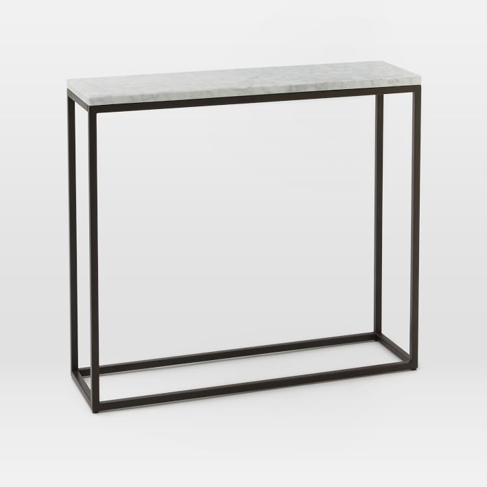
Here are a few links of items I'd do for the entry there. I think they need to be small and scaled down a bit. These are 36" wide, not sure what dimension you have there, but something light like this would work if the width does.
Pottery Barn - My first pick
This might be a good mirror for over those consoles. I like that it's 18" wide, so the width won't crowd the space. One of the problems with the mirror you have is that it lines up with the door frames.
Varying that height, so that the mirror is either taller or lower, will give that space some breathing room and it won't feel so boxed in.
As far as a rug selection goes for your living room, since the furniture is dark leather, I'd keep it kind of rustic and textured, but lighter, like the gray walls. Your gray wall color is good with the warm, neutral oak, it cools it down and we need to continue that with the rug. Adding in more gray in a lighter shade will soften the room and visually separate the furniture from the wood flooring. Something like this.
Plus, it kind of goes with everything. :-) Make sure you get it big enough, the 9 x 12 is largest size, so that all the fronts of the furniture are sitting on top of the rug. Back legs can be off, but front legs need to be on the rug to connect the grouping.
Hope this helps! Thank you!!!


