I have a fab contemporary home to share with you today that was on the Dwell on Design Fall Home Tour that I attended last weekend in California.
This home was designed by Vitus Matare, and is for sale through The Agency, William Baker and Brian Linder.
Contemporary style is prevalent in these new homes
I got a crash course in California contemporary style on this home tour, seeing how wall to wall sliding glass doors, sleek, beautiful surfaces, linear fireplaces, large kitchen islands, warm natural wood, floating bathroom vanities and the prevalent indoor/outdoor living concept drives some of the home design in this area.
If there is a view, you can bet that they will capitalize on it, with walls of glass that open up wide to double your living space.
I was gifted some free tickets to the tour from Dwell on Design, in return for writing about some of these beautiful homes here on my blog. It is such a treat to get to share these with you, my readers!
All images in this post were taken by me.
Now, take a look and see how those design mainstays, I mentioned above, are all incorporated into these homes.
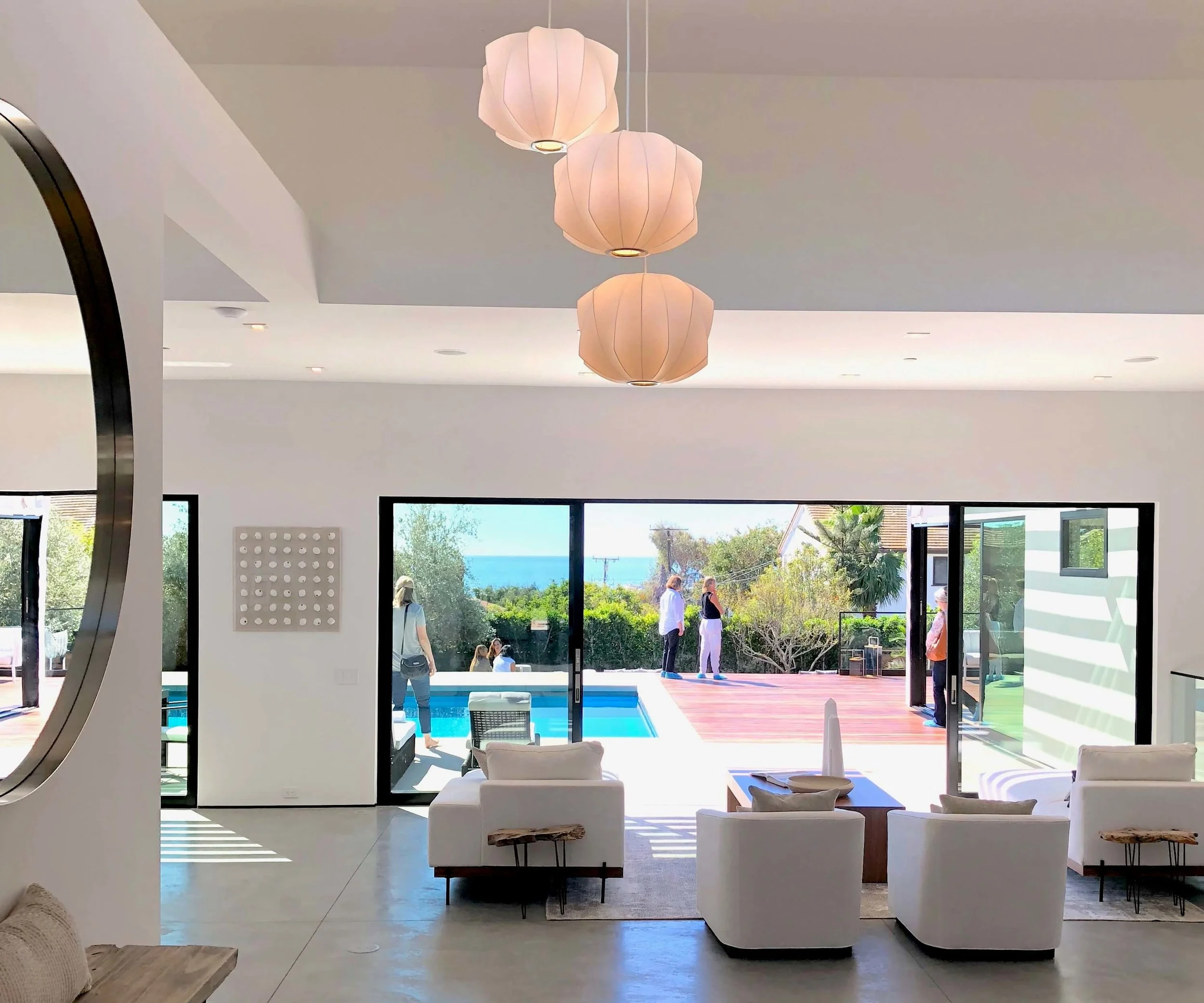
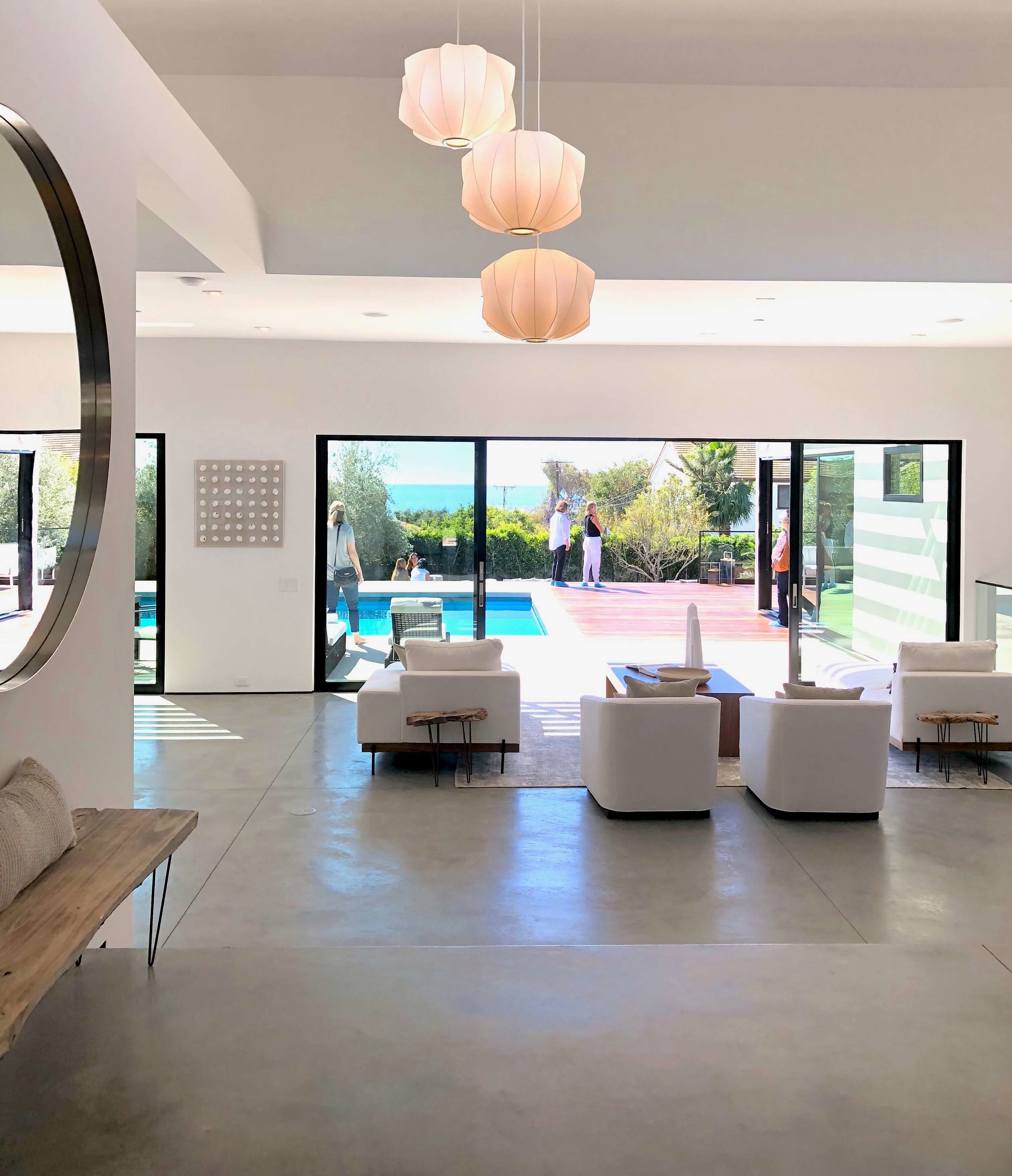
The living room is spacious and wide and opens out onto a patio with black framed sliding doors.
The entry steps down to the living room have beautifully simple detailing. Concrete floors flow throughout this home. Natural oak cabinetry, doors and closets add warmth to the spaces.
California contemporary design - Dwell on Design’s Fall Home Tour, Designer: Vitus Matare #concretefloors #slidingdoors #contemporarystyle
California contemporary design - Dwell on Design’s Fall Home Tour, Designer: Vitus Matare #stairs #concretefloors
No baseboard was used in this house! There was a simple reveal at the base of the sheetrock, painted black for delineation. It contributed to the very clean style of the house.
The bedrooms and den had wood flooring and no transition strip!!
California contemporary home, Dwell on Design’s Fall Home Tour, Designer: Vitus Matare #concretefloors #woodfloors #contemporarydesign
Large open kitchen in this contemporary home
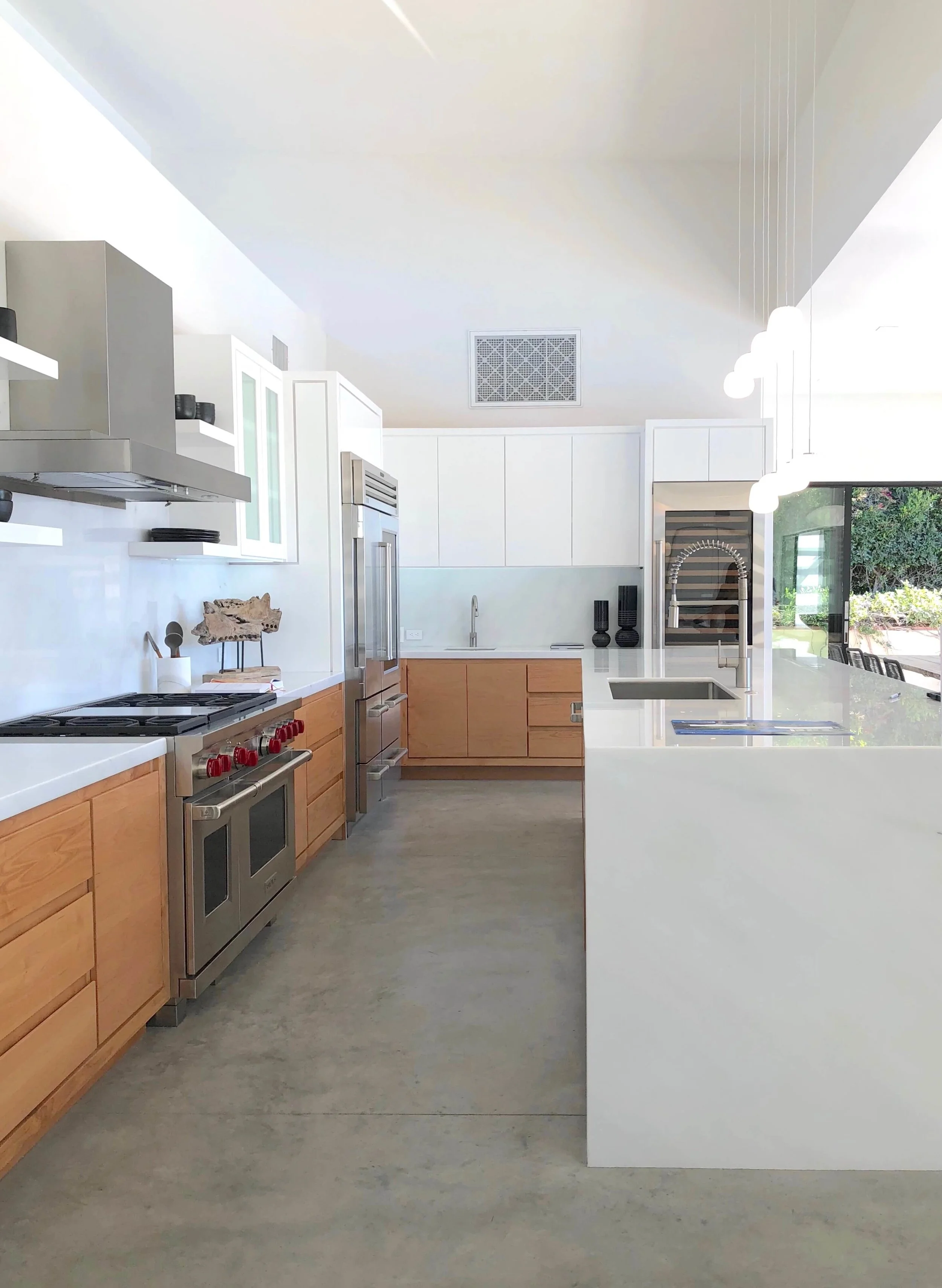
To the left, as you walk down the steps, is the large kitchen. I love that they brought some wood into this kitchen in the base cabinets. That kitchen island is actually 42” tall with the perimeter cabinets being 36” standard height.
I spoke with one of the representatives who said that this has been done in a few homes there, with taller homeowners especially liking the height. I have noticed with my deep sink, that I stoop over some while doing the dishes and it bothers my back after a bit.
Interesting concept, no? There is a sink at the 36” height over on the side wall of the kitchen.
I think that is rather daring with a home built on spec, but maybe not for the LA area. ???
Note the polished slab material here as countertop and backsplash. I love the way the light reflects off the white countertop material.
California contemporary kitchen - Dwell on Design’s Fall Home Tour, Designer: Vitus Matare #kitchenideas #kitchendesign #kitchenisland
California contemporary kitchen - Dwell on Design’s Fall Home Tour, Designer: Vitus Matare #kitchenideas #kitchendesign #kitchenisland
Large kitchen island in contemporary home - Dwell on Design’s Fall Home Tour, Designer: Vitus Matare #kitchenideas #kitchendesign #kitchenisland
Outdoor areas part of the living spaces in this contemporary home.
Moving outside on to the patios, this is the view back into the living room/entry. The modern pergola that wraps the back side of the house creates a nice pattern on the white stucco and gives a little sun protection there. It’s just the right amount of bold detail for all the geometric shapes.
There is a roof deck above the house too.
California contemporary home, Dwell on Design’s Fall Home Tour, Designer: Vitus Matare #pergola #slidingdoors #patio
California contemporary home, Dwell on Design’s Fall Home Tour, Designer: Vitus Matare #pergola #slidingdoors
California contemporary home, Dwell on Design’s Fall Home Tour, Designer: Vitus Matare #outdoorshower #pergola
Bathrooms on this home tour
Off that master bedroom, above, is the most amazing bathroom that opens up to a small private patio.
So lovely! Just a few feet of patio on the other side of a big slider opens up the room immensely!
Master bathroom in California contemporary, Dwell on Design’s Fall Home Tour, Designer: Vitus Matare #bathroomdesign #freestandingtub #bathroomideas
Natural Stone Use in this contemporary bathroom
Full natural stone slabs were used to wrap the walls of this bathroom. I just love how the grain of the slab follows inside the niche. Beautiful work!
Master bathroom in California contemporary home, Dwell on Design’s Fall Home Tour, Designer: Vitus Matare #bathroomideas #bathroomdesign
Master bath shampoo niche in California contemporary home, Dwell on Design’s Fall Home Tour, Designer: Vitus Matare #bathroomideas #bathroomdesign
On the wall with the vanity, a black textured granite was used. It took me awhile to figure out what it was and I had to ask several people. The texture was a tiny slight, honed crosshatch. Really interesting.
I just love the trough sink too. This bathroom has such a spa-like feel.
Master bathroom in California contemporary home, Dwell on Design’s Fall Home Tour, Designer: Vitus Matare #bathroomideas #bathroomdesign
Master bathroom in California contemporary home, Dwell on Design’s Fall Home Tour, Designer: Vitus Matare #bathroomideas #bathroomdesign
The other bathrooms were tiled in an elongated subway in black and white, with white Carrara marble used for the countertops, shower curbs, benches, and shelves.
Bathroom in California contemporary home, Dwell on Design’s Fall Home Tour, Designer: Vitus Matare #bathroomideas #bathroomdesign
Bathroom in California contemporary home, Dwell on Design’s Fall Home Tour, Designer: Vitus Matare #bathroomideas #bathroomdesign
Bathroom vanity in California contemporary home, Dwell on Design’s Fall Home Tour, Designer: Vitus Matare #marblevanity #bathroomideas #floatingvanity
Bathroom vanity in California contemporary home, Dwell on Design’s Fall Home Tour, Designer: Vitus Matare #bathroomideas #blacktile
Shower bench in California contemporary home, Dwell on Design’s Fall Home Tour, Designer: Vitus Matare #showerbench #blacktile #bathroomdesignideas
The powder room off the entry, had a dark grasscloth wallcovering that was hung horizontally on the walls to create a subtle banding effect. The marble was used here too. Love the beefy floating countertop.
Powder room in California contemporary home, Dwell on Design’s Fall Home Tour, Designer: Vitus Matare #powderroom #powderbath #marblevanity
The closets were elevated in style with materials and a custom built design.
Gorgeous oak was used to outfit the closets in this home, with black rods and hardware. It just gave such a feeling of quality and richness to the overall feel.
Master closet in natural oak in contemporary home - Dwell on Design’s Fall Home Tour, Designer: Vitus Matare #closet #cabinetry #closetdesign
Closet in natural oak in contemporary home - Dwell on Design’s Fall Home Tour, Designer: Vitus Matare #closet #cabinetry #closetdesign
The laundry was designed in a similar style, hidden behind some wood/glass sliding doors in a hallway.
Laundry with wood framed sliding doors in California contemporary home, Dwell on Design’s Fall Home Tour, Designer: Vitus Matare #laundryroom #laundryroomideas
The home office had a desk that was perfectly designed for this home. The combination of slab with a waterfall side and then the natural wood on the other, was such a nice mix of materials.
(Oh, and take a look at that tub chair! :-)
Home office in California contemporary home, Dwell on Design’s Fall Home Tour, Designer: Vitus Matare #homeoffice
I don’t know about you, but I think I could handle this California lifestyle. :-)
Outdoor patio, California contemporary home, Dwell on Design’s Fall Home Tour, Designer: Vitus Matare #patio #loungechairs #poolside
Stay tuned for more home tours coming up soon! Sign up below to have them delivered right to your inbox. ;-)


