
Oh boy, we’ve heard this all over the internet…..hang your drapery at the ceiling, not right on top of the window!
There are lots of examples I see of how drapery has been mounted too low. It is a common problem.
This drapery was mounted just right above the window and would benefit from being raised higher. There is plenty of room to go up the wall and of course, the panels are stacked on the floor. The installation just feels like it was improperly done.
However, I don’t always think your knee jerk reaction should be to go to the ceiling or just under your crown moulding.
If hanging your drapery up at the ceiling creates a big blank gap of wall space, then I think you need to either lower the drapery somewhat or find a way to deal with that blank space.
Because frankly, this looks odd to me.

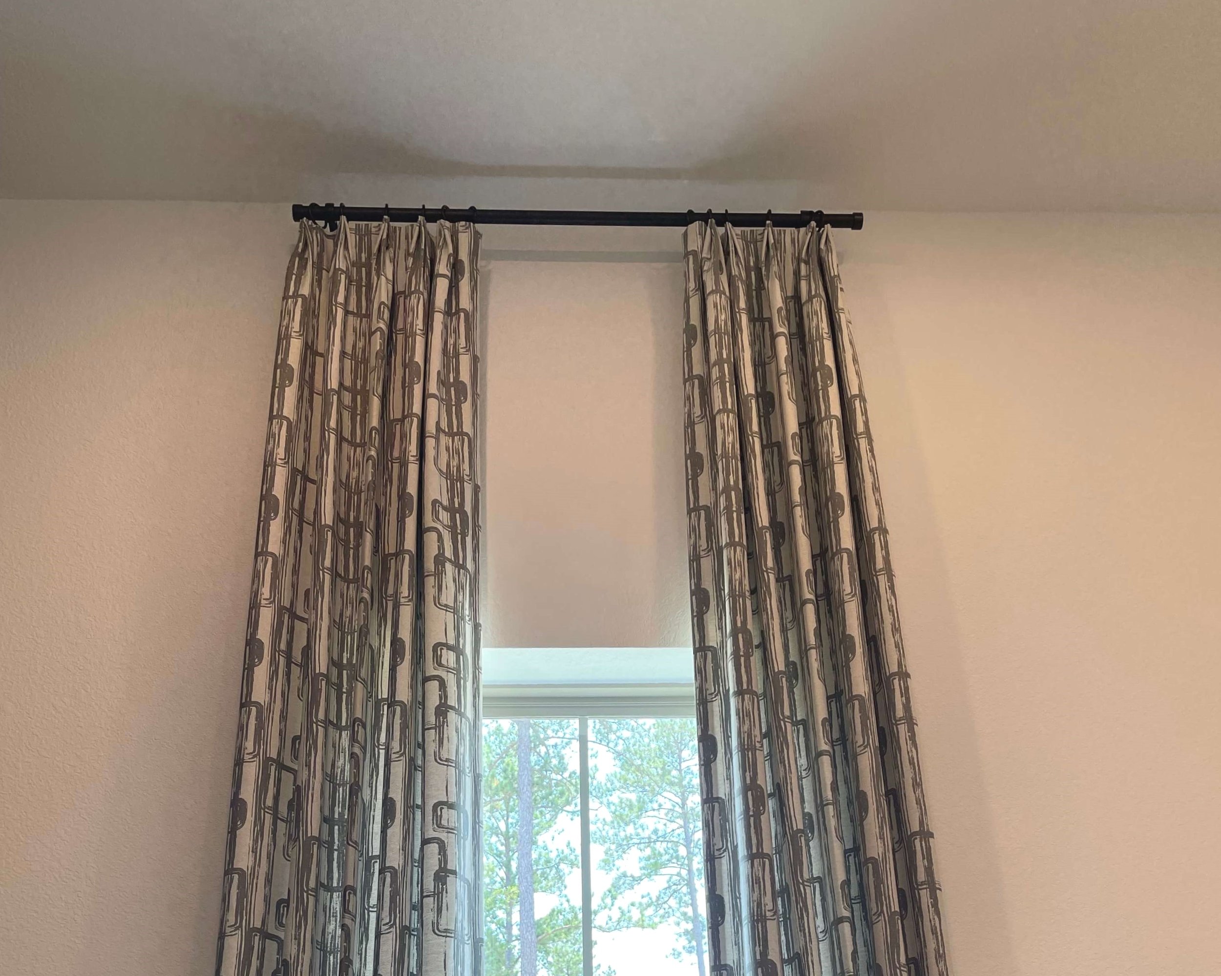
Drapery treatment mounted too high. Halfway in between would have been perfect.
If you have two feet and over of blank wall space between the top of the window and the rod, then I think it needs to be addressed or filled with some kind of purposeful look.
I’ve got a few options for you below, if you find yourself in this predicament.
Option 1 - A Roman Shade
I have done this in the past, hang a Roman shade under the drapery to align with the top of the drapery panel. You don’t have to make sure the Roman shade covers the whole window, dropping to the sill, it can be just a couple of feet long and be a dummy shade, that always remains open.
This will cover that entire blank wall space with an intentional look.

The woven wood shade covers the wall space above the window and aligns with the top of the curtain panel. carlaaston.com

This shade above covers the blank wall space over the top of the window so that curtains hung near the ceiling don’t look so oversized. carlaaston.com
Here’s a sitting room from one of my Q&A’s. The windows here were really short, especially compared to the tall opening into the family room beyond.
I proposed this type of window treatment to help make the window look taller but I didn’t see the need to go to the ceiling here.

BEFORE - The window looks really short compared to the ceiling height and the tall opening right beside it.
PROPOSED - Taller window treatment with a woven wood shade to cover the large blank wall space above the window. carlaaston.com
Here’s how this room finished up. The window treatment makes the window look taller and the short window was camouflaged.

AFTER - The short window was camouflaged with the Roman shade and taller draperies.

The dotted line indicates the existing windows behind the shade. They can pull the shade up to just below the top of the window and have a nice open window but cover up the painted sheetrock wall above.
Option 2 - Wall Decor
Sometimes you really need tall drapery and the blank wall space is exceptionally huge.
In that case, I’d look for some kind of wall decor, like some carved panels to mount in that space so that it feels intentional.
This Q&A below involved the window behind the headboard. The homeowner didn’t really like the window treatment they had.
They had a window on the other wall, the same height as this window. The wall was shorter there though, since the ceiling slopes to the side walls.

Q&A on window treatment - These draperies seem rather short since they are mostly covered up by the bed and there is a taller wall to use. carlaaston.com
On the bed wall, the window treatment felt really short though, since it peaked here. I felt like this window was so blocked and the treatment rather anti-climactic. It deserved some height here on this wall with the taller wall space.
I recommended adding a sunburst type decorative mirror in that space between the panels to give it some purpose.

Solution for the window treatment problem with a low window behind the bed. carlaaston.com
In this bedroom, below, I suggested they do tall drapery at the sliding door, as the ceiling height is really high, and use the panels that are above the bed, to fill in the blank wall space above.

Short drapery panels on the slider need to be taller. The panels above the bed can be used to create interest above the sliding door, between the drapery panels. carlaaston.com

This uses the decorative panels in a way that feel intentional, with taller drapery. carlaaston.com
Option 3 - Divide the wall space in half for drapery height
Sometimes if you just divide the wall space in half and mount the rod there, it is just enough to get a taller look to your window treatments and your room, but it doesn’t create that big gap. In other words, hang it higher than the top of the window, but don’t go overboard.
This curved wall that we draped with sheers were just the right height, in my opinion. Any higher and they would have looked too tall without dealing with the blank wall space. Any lower and the draperies would have looked short.
BTW, they had black out shades already installed inside the window frame.

Beautiful sheers installed in a recent project mounted halfway between top of window and bottom of crown. carlaaston.com
Even though the ceiling was another 18”+ higher, below, I only went about 14” above the window for this dining room drapery mounting height. It just would have created that big gap of blank wall that was not necessary here. The window was already a tall one in this room.

Drapery not going all the way to the ceiling here, I just felt it wasn’t necessary with this tall window. carlaaston.com
I like this living room’s drapery rod mounted halfway between the window moulding and the bottom of the crown.
Drapery rod mounted halfway between window and bottom of crown. carlaaston.com
If I ever do draperies in my bedroom, here’s where I’d hang them. Not at the ceiling, just under the crown, I’d hang them right in the middle, between the top of the window and the crown.

My own bedroom windows, the dotted line indicates where I’d hang the drapery rod.
In this bedroom below, with grasscloth wallcovering, even though the ceiling wasn’t high, I wanted to see some of the wallcovering at the top of the window treament. I didn’t want the drapery to run from floor to ceiling.

Draperies hung low enough to see the wallcovering on the wall above it. carlaaston.com
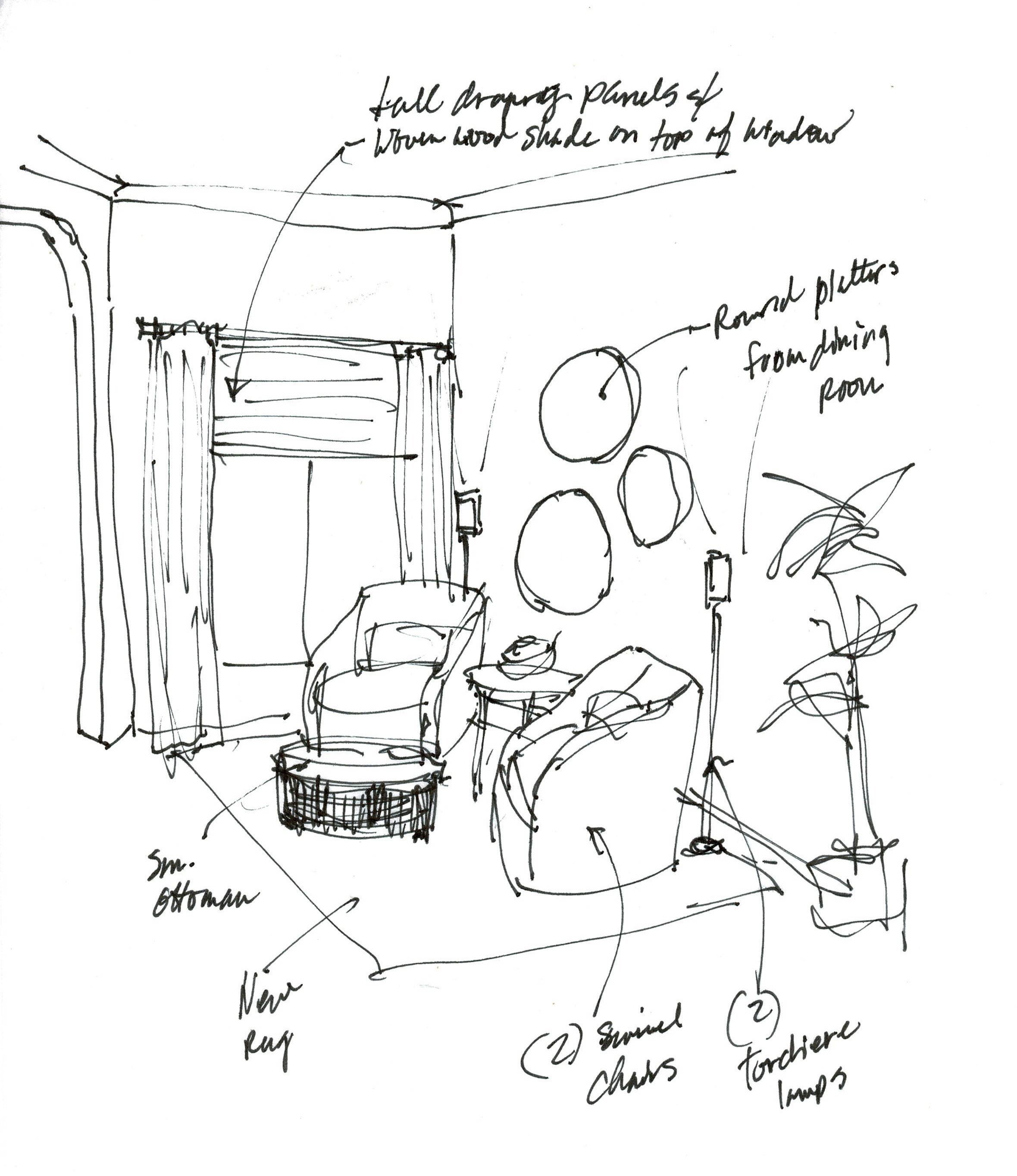
It really is all about proportion and balance. Doing an elevation sketch to scale helps get sizing correct and enables you to see clearly how to make the wall look well-designed. :-)
Design Advice In Your Email Inbox
My Designed in a Click service is now open. I’m slowly getting back on my feet again after knee surgery but won’t be taking any full service projects until 2024. Thanks for your patience!
This blogpost was thoughtfully written by me, Carla Aston, and not by AI, ghostwriters, or guest posters.
Pin this image below to Pinterest, to save for later!
