A reader recently emailed me photos of her kitchen remodel in progress and she was stumped with what to do with the hood wall elevation. Appliances were purchased, demo had been done, they were about to meet with the cabinetmaker and didn't know how to lay out the wall where the range and hood were planned to go.
This kind of partial bit of help, to get a homeowner unstuck where they can't see a solution, is just the kind of help that my Designed in a Click service was made for. It's not advice for an entire project by any means, but it is perfect for helping a homeowner make some choices with their given set of circumstances.
Here was the question:
.......We have ordered new appliances. I need help on how to design the range hood.
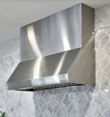
Our wall hood is 18” high and we have ordered an additional 30” extension, making the hood 48” high, but are unsure of how to carry it up to the ceiling.
Here was the hood and a pic of how the hood, with the extension they ordered, would look together.
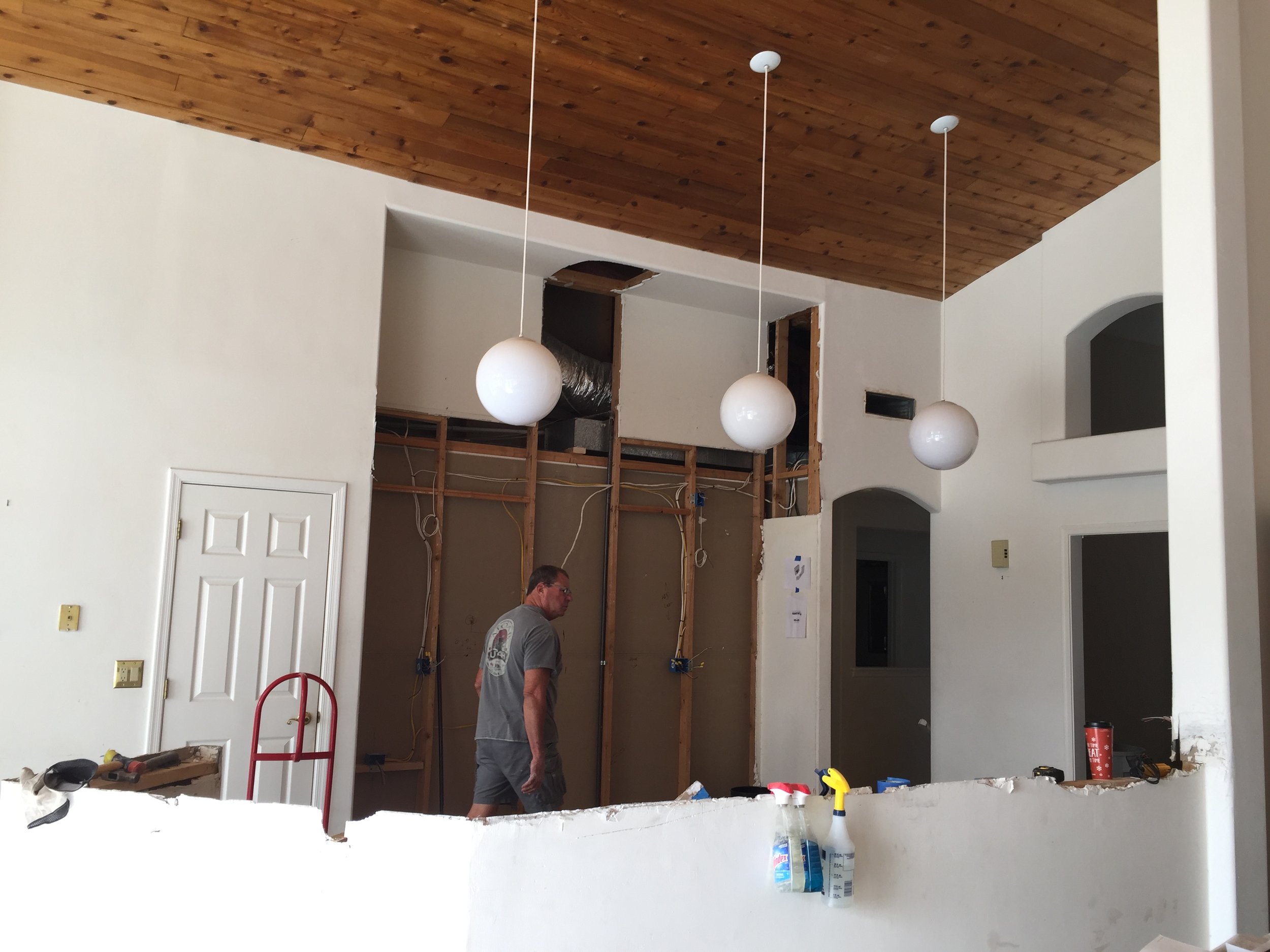
Here were more pics of their kitchen in the remodel progress.
I didn't have dimensions of the wall, but I could definitely see that they had a very high ceiling and a tall wall elevation to work with. I know that venthoods typically need to be mounted at around 30" above the cooktop to be most effective.
sTart with the size of the kitchen hood and the height it had to be located on the wall elevation
It's always smart to start with your givens. The hood was already selected, so we had to work with that. We also had the niched wall area where it was going, the dimensions of a 36"H countertop and range and then the 30" space between the cooktop and the hood bottom that had to be maintained.
The hood, as ordered with the extension, would not reach the bottom of the soffit or furr down that was currently in place. If it was installed floating on the wall with tile all around, it really would just kind of look like a giant stainless steel box floating in the middle of that space. There would be a big open space above this large hood.
If there were cabinets on each side that butted up to it, (and since the rest of the kitchen is open, I figured they would need a few upper cabinets there) it would just be way too ordinary for the expense and quality they were putting into this room, to just add cabinets on each side, aligning with the top of the hood.
That would create a dead space above, kind of looking like what was there previously, and if there's anything I can do to eliminate those dust catcher spaces up high in a kitchen, I like to try.
I didn't want to furr down any more to shorten that wall height. That is, in fact, one of the fabulous attributes of this room, the super high ceilings and spacious, grand ambience already in place. That's exactly what you would want to capitalize on or celebrate in the design, something good that is already going on in the space.
If they had purchased a chimney style hood or some other type, I might have opted for some tile surrounding the hood to make a bigger tile statement there. Although really, a chimney style would have been really tall and skinny looking here. I think those are good with 9' or 10' ceilings, but not much more than that.
I do love cabinets to the ceiling and decided that a wall of cabinetry there would sort of marry the kitchen element or rather the function of that space that is down low in the room, to the ceiling above. It would draw attention upward and feel like we were connecting the whole space together.
So, here was what I suggested for that wall.
(A rough sketch, I know, but remember...this is a quick recommendation type of service.)
About 12" of mouldings and trimwork to bring those cabinets down a little, then some upper boxed cabinets that would meet the given hood height that was basically set for us. They'd likely be more vertically shaped than I drew, but you get the idea.
Kitchen countertop at 36" AFF. (Above Finished Floor)
Bottom of kitchen hood at 66" AFF.
Top of kitchen hood at 114" AFF.
What is left over, less the 12" trimwork at the top, is the size of those upper cabinets which they could do with glass panels if they wanted.
Here's how I advised her on the backsplash.
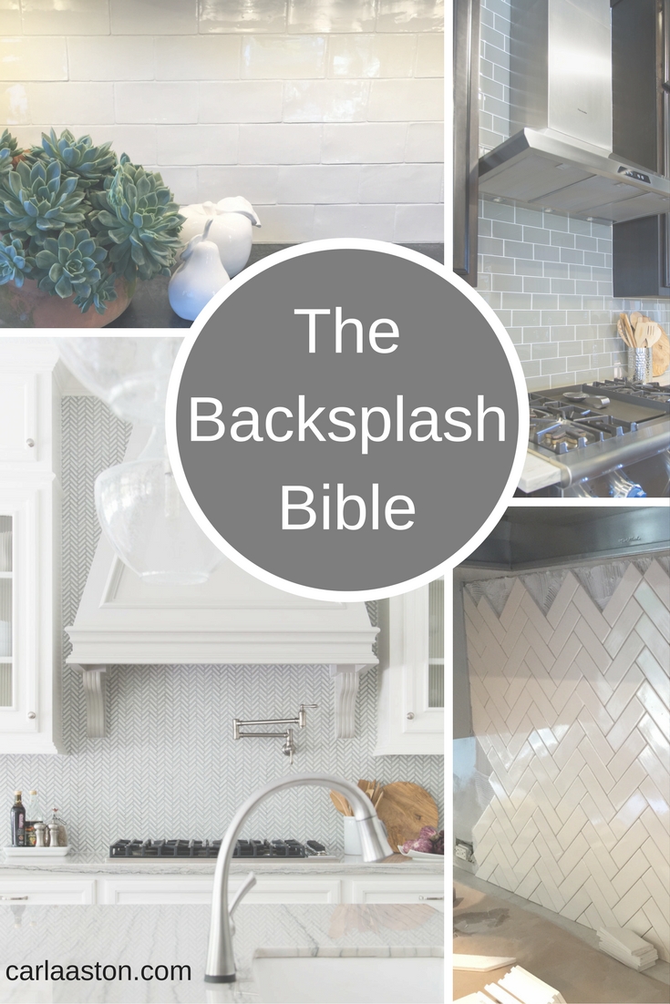
I would do some kind of really pretty mosaic of some kind for the splash, since, especially by comparison to the whole wall, it doesn't take up much room. I wouldn't go for high contrast between the cabinets and backsplash or a big graphic pattern, as it will look like a low, wide stripe on the wall. Get something that will provide a little detail and variation without being too overwhelming.
Something like these below.
My blog contains affiliate links on products which means any purchases, at no additional charge to you, render me a small percentage and make this blog possible. Thank you! :-)
In honor of Black Friday weekend and Cyber Monday coming up, I've taken $2 off all my eBook Guides in my Outlet Shop, good until end of day, Monday Nov 27th.
If you need info on kitchen backsplash design, flooring selection and design, paint color selection, furniture budgets, kitchen remodeling tips and much more, then check these out.
If you are a designer and would like more info on how I work these online consultations (my "Designed in a Click" name has been approved for copyright, btw :-) then you might want to get your copy of that eBook Guide right here.


