

So, let’s say you’re a little late to gray party, you might even still be on the fence. The last thing you want to do is go gray and then have the trend pendulum swing another direction. If you make the jump to gray, how do make sure it will last another 10+ years?
1. Pair it with color! Gray and white with a bright color works so well. I worked on a family room where the big, dark gray sectional was looking rather dull. After bringing in some orange accents, the room really came to life.
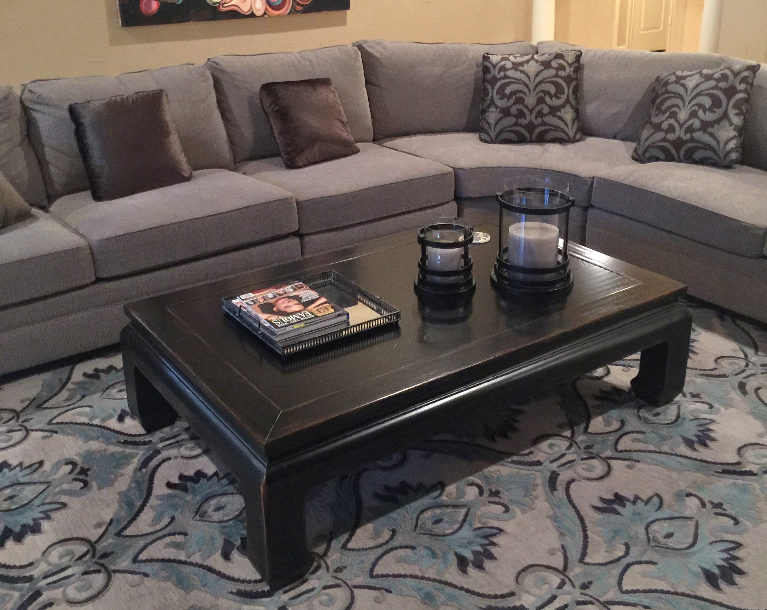
Before - the grays all blended together for a dull, dark look
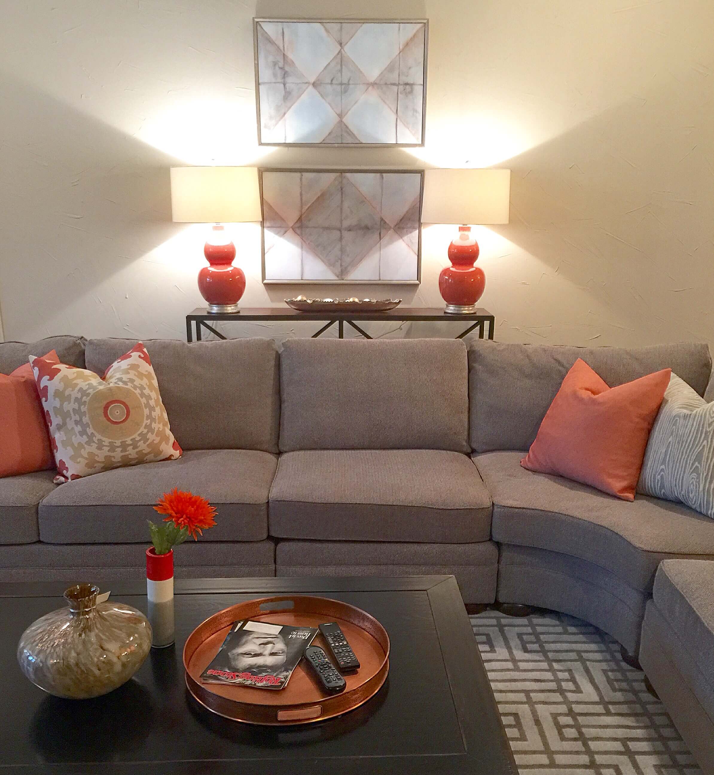
After - bright orange accents in copper, fabrics and lamps | Carla Aston Designer

Adding a bright color to gray livens things up and gives a fresh look. Gray sectional with orange accents added in with pillows, lamps, copper tray and accessories.
I worked on another family room where we used gray walls, white trim and then various light and dark grays on the furnishings. We brought in bright colors with pillows in a citrine. Yellow looks great with grays, as does emerald green, navy blue, and just about every other vibrant color of the rainbow.
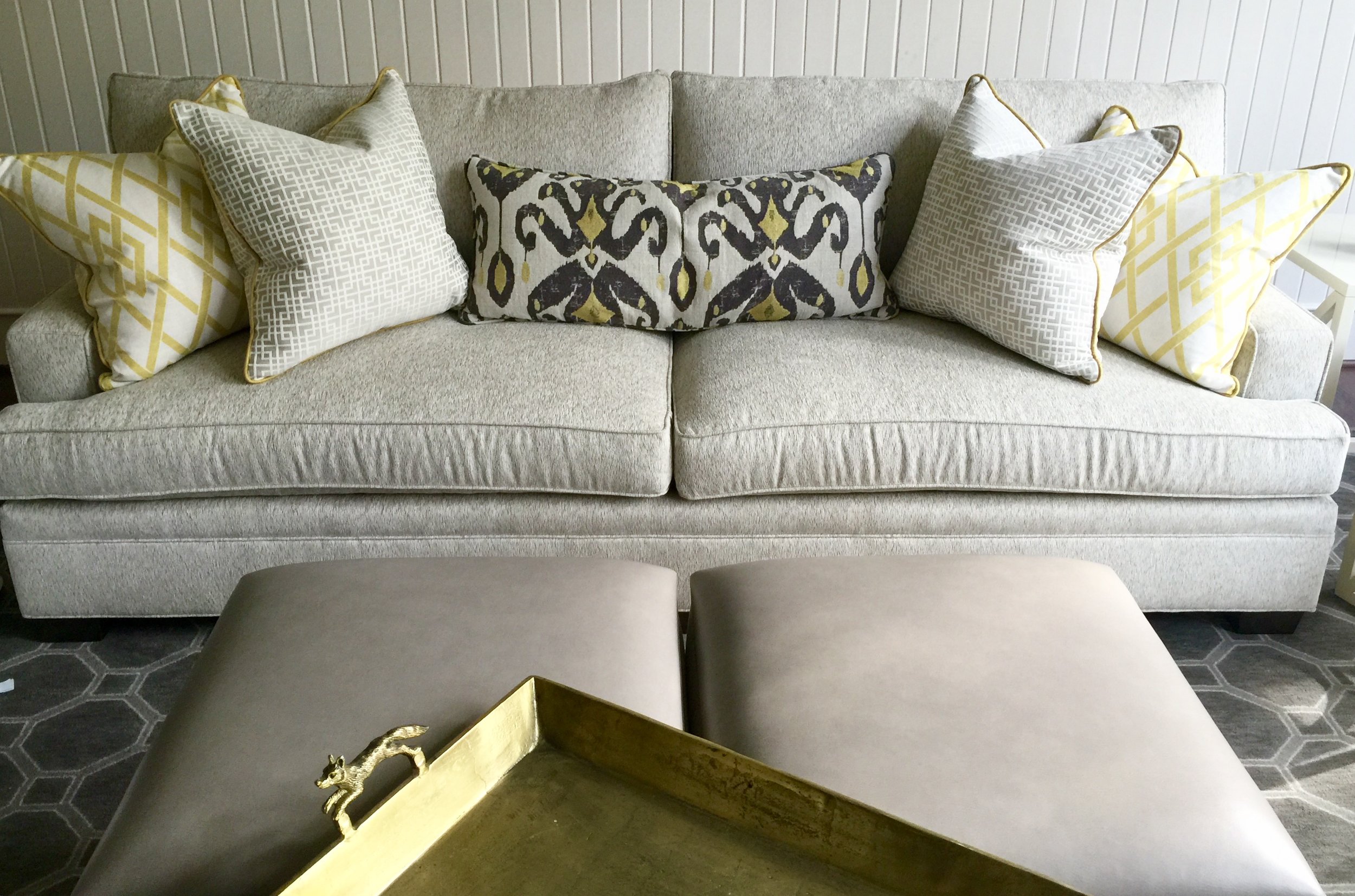
Gray sofa, rug and ottomans with yellow pillows and brass tray | Carla Aston Designer
2. Use it on furniture. Let's say you have a creamy white envelope and you just want to layer in some gray, like I mentioned in this post. Add the gray in on furniture, either on upholstery, drapery, pillows, or on wood furniture, like in this image of one of my projects.

Gray nightstand in creamy white bedroom with navy mirror and pillow | Designer Carla Aston | Photo by Tori Aston
3. Use a light gray on trim and doors in lieu of white in a dark spaces. I’m using Repose Gray in a master bedroom as the neutral on trim and on a bank of built-in cabinetry. We’re doing navy grasscloth wallcovering on the walls. White would just have been too jarring and high contrast. This gray will be a more soothing transition between trim and walls.
Design plan for bedroom with navy grasscloth and SW Repose Gray for trim and cabinets | Carla Aston
4. Use a dark gray in smaller spaces to add drama. You’ll get a big hit of gray, but it’s confined. You don’t have to worry about doing it everywhere. A powder room or maybe a library or dining room would be a good place to go dark gray. It makes that space more intimate and cozy. I did SW Roycroft Pewter in a home office recently that looked amazing and rich. It sort of feels like you’re doing a “color” without forcing you to pick a shade other than a neutral. It kind of gives you more flexibility that way.

Dark gray home office in SW Roycroft Pewter | Carla Aston Designer
5. If you use cool grays, add some contrast in there to make it feel less cold or monotone. You probably shouldn’t go from one extreme to the other. If you’re going all cool tones, don’t forget to add some warmth with elements like wood flooring, wood features, or brassy, warm-toned metals. The space will appear more layered and will have a timeless, less dated appeal.

Gray bathroom with Carrara marble and brass | Designer Carla Aston

Gray and warm wood combined beautifully on my winter tabletop that uses walnut cutting boards as chargers | Carla Aston
Sound complicated even after all this? You can hit me up with a one on one Q&A right here.
Need some help with paint selections for your home? I've got a great guide right here, full of info, Q and A, designer tips and tricks, and more. Why pay for a consultant or a big how-to book when you can have my handy guide, downloaded right to your computer, ready for reference when needed.
