I’m sharing two projects today from the archives of my Designed-in-a-Click service, both having to do with furniture arrangement.
Furniture arrangement is hard to apply general rules to, it’s all so dependent on the architecture, the purpose and use of the room, the traffic flow, the focal point, even what’s happening in the adjoining spaces. We can talk rules all day and really, they’ll be blown out of the water in the next project that comes along.
Click HERE for more details.
In my Designed in a Click service, I offer advice from my point of view, looking at a homeowner’s circumstances quickly, taking into account as much of their directives and desires as possible with our limited time frame.
This service is like going through a drive-thru window for interior design. You’re not going to get a gourmet meal (full service design with all needs taken into account, details conceptualized and acted upon). But I feel like I can take a bird’s eye view of the project and come down with some specific actionable items in a fairly short amount of time that can give homeowners some direction and guidance from a fresh but experienced perspective. :-)
These consults are descriptive with words or quick, raw sketches.
If you want more detailed storyboards or drawings, then you have to pay more for that. This service is really just all about the ideas.
These two projects involved furniture layouts and I’m excited to share them with you today.
This project was a living room, a nice, big space, that had a focal point fireplace and some mid-century style. The homeowners had purchased some new items and felt they didn’t really know what the best solution was here. They wanted to watch tv in this room, have friends over, and utilize this space as much as possible. They wanted the space to feel finished, pulled together, and they needed a direction or goal to work toward.
Here was their space.
Designed-in-a-Click, Q&A Interior Design Advice
They purchased a piece of furniture that fit that far right corner of the room, next to the fireplace. They wanted to know whether they should angle it, position it against the wall right by the fp or possibly even relocate the tv to another wall.
Here was my solution.
Designed-in-a-Click, Design advice done in a quick, Q&A style.
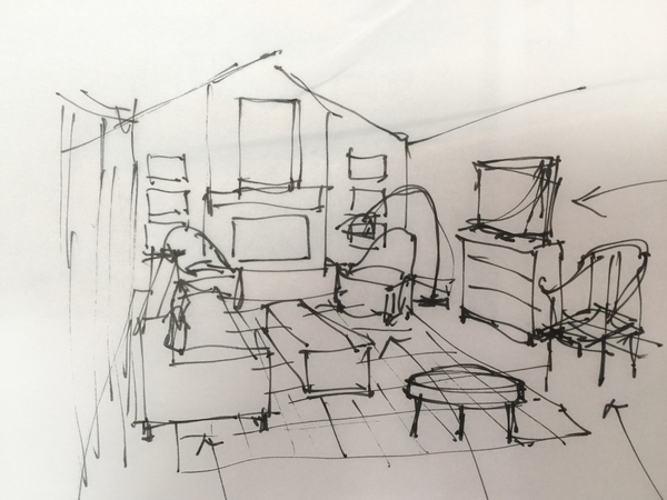
I moved the tv to the side wall to balance the room. The tv, as they had placed it, directly adjacent to the fireplace, just took away from the symmetry of that focal wall and reduced the impact that the fp wall had.
I pushed the sofa back a bit, it was floating a bit too much in the space. Then decided they could use the curvy upholstered chairs flanking the fireplace, adding to the grander aesthetic of that focal wall.
I preferred the Ming chair against the wall, by the tv center, because that makes a nice silhouette there, then added in a low, round ottoman to float in the room to counterbalance some of the rectangular boxy shapes.
Art placement that capitalizes on the focal wall’s symmetry was in order, (stacked art pieces on both sides of the fp) and then a mid-century style arc lamp could be nice in the corner. A patterned rug would bring some color and pattern overall and tie the furniture together.
I also encouraged her to go for some hard surface flooring, wood or whatever they had in the adjoining rooms, as the wall-to-wall carpet kind of downgrades the living room. Of course, some nice draperies would soften the room too.
Here's another furniture arrangement that needed some tweaking.
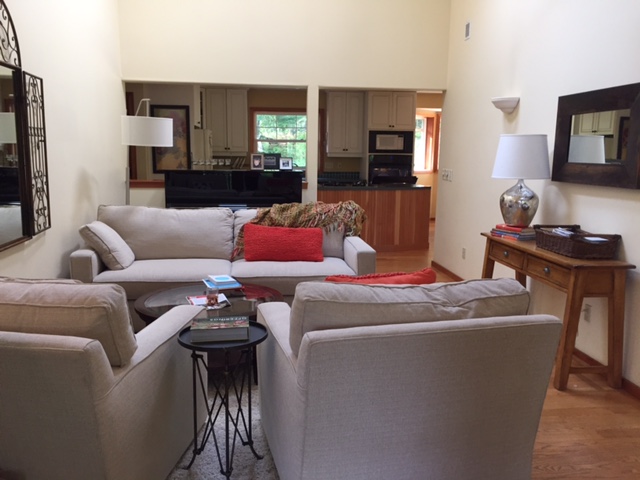
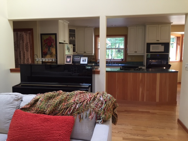
In this home, I was doing some advice for another part of the house. The homeowner sent these photos so I could see adjacent spaces. This living room had a tall ceiling with some nice natural light from the skylights above, but the furniture arrangement looked a bit awkward and rather like a waiting room. There had to be clear path for passing through, but as a living room, I felt it could read more as a destination with just a little bit of tweaking.
Designed-in-a-Click, Q&A Interior Design Advice
Designed-in-a-Click, Q&A Interior Design Advice
I recommended placing the sofa against the wall with the two chairs flanking the sofa, for a more open arrangement. Then, I suggested placing the nice piano on the long wall with the mirror hanging vertically above it, since that wall had plenty of height.
Sitting where it was, against the opening to the kitchen, the piano looked a bit awkward and like it doesn't have an official spot in the home. I liked it placed against the wall facing the seating group. It would take advantage of the tall ceilings there, draw your eye up to appreciate the volume of space, and make "music" the center of attention there. I think pianos are nice conversation pieces, and there wasn’t really anything to sort of draw you into the space.
I liked the idea of doing a large patterned rug that would marry all the pieces of the room together. I recommended something colorful...maybe a flatweave rug. Of course, this is a pass through type space, but it doesn’t have to feel like one.
Designed-in-a-Click, Q&A Design Advice
These quickie advice projects are kinda fun for me and can help get you over some specific design dilemma you might have in your home. If you need a little design advice to get you on your way, just click right HERE.
Want to see some of the items I proposed for their rooms? Check them out below. As always, these links are affiliate marketing links where I might make a small percentage off the purchase at no additional cost to you and I greatly appreciate any purchases you might make through them.


