There are basic design principles that I go back to repeatedly when making decisions on a project.
You know, design dogmas I have found that repeatedly seem to apply to almost any situation and have, therefore, become a bit of a guidebook for me.
Generally speaking, while there are always certain instances where you have to go against the rules, or where the principles might not apply, these design dogmas do help guide my path.
And I find they come in handy when I tend to veer off in an odd direction, or if something is just not feeling right.
Should multiple rooms in your house share the same feature?
This particular design dogma I’m talking about today has to do with putting a material, a detail, a style, etc. somewhere in your home just to match what you have elsewhere in the house.
For example...
Let’s say you have traditional, fluted mouldings in your home on all your doors, but you did a more contemporary or transitional look in the bathroom. I’ve had clients that have done that before: they wanted to depart a bit from the overall style of the home. And in an enclosed space… Sure! Why not?
However, should you put those fluted mouldings back into your bathroom just because you have them everywhere else in the house?
No.
Another example:
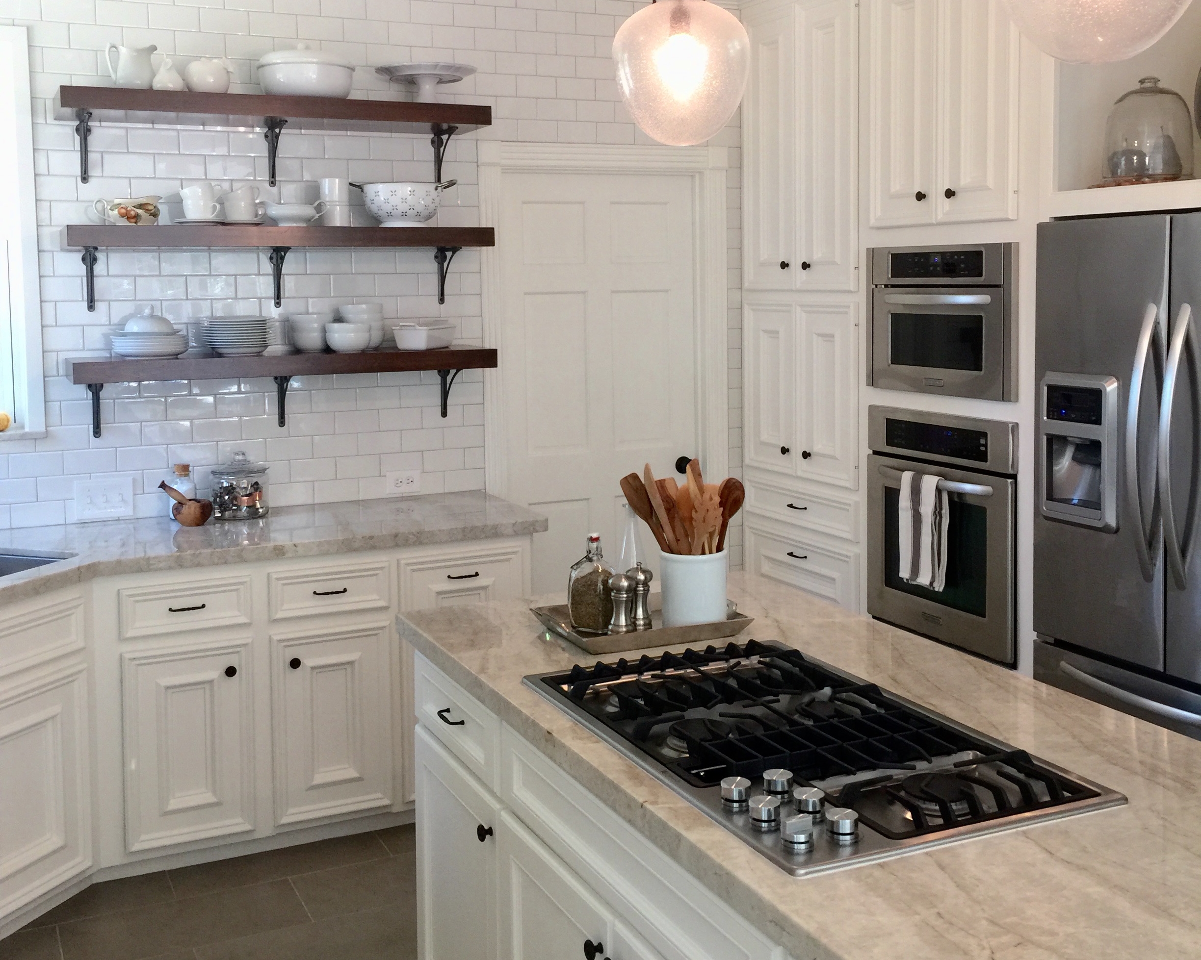
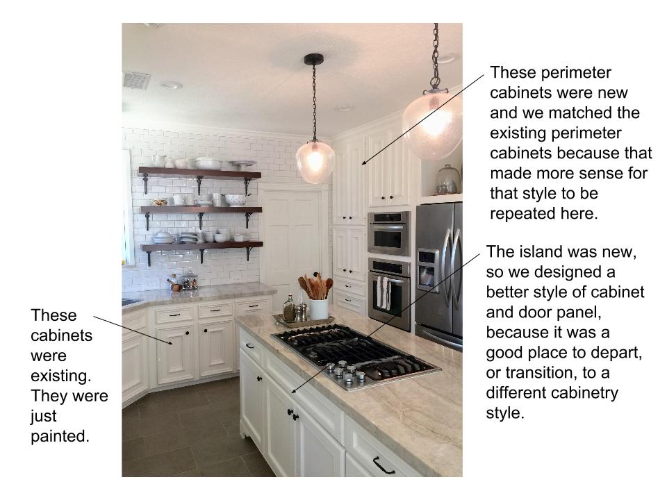
Let’s say you have a kitchen island that is new, but you’re keeping your dated, older perimeter cabinets and just giving them a lift with a coat of paint. Should you then design the new island to match the old cabinetry?
No.
Another example:
Maybe you have a wood flooring that you don’t love in most of the house, but in one area is a different type, maybe a tile, that you want to replace. Should you replace it with the flooring you don’t love so you can have it everywhere else for consistency’s sake, just so you will have a continuous look, even though you might not love that flooring?
No.
So, are you beginning to catch on to the idea I’m presenting here regarding one of my basic design principles?
Don’t put something you don’t love, something that isn’t great, something that isn’t really the best solution for your space in the space again. Don’t just resort to that knee-jerk-reaction decision, that finish, that detail. Instead...
Give it some thought.
Make a decision based on the whole, as well as on the separate space. Think about how that finish, that detail, that style, that material will fit into a room on it’s own, as a standalone space.
Don’t put something into a space just because you think you have to match what’s there, or carry something on into an adjacent space just because everyone else does it as a general rule.
Continuous flooring is really a big love of mine, btw. However...
I hate to see people install more of something they don’t like, or just isn’t that great, only to make it continuous...IF there is a good place to transition.
In many of these instances, where you want to depart, or where you want to get rid of some style you don’t like, you have to take into consideration where the transition is. Is there a logical place to move from one material, style, or design to another while it still makes sense to do so?
For example, in the case of the kitchen perimeter cabinetry and the island…
If you’re going with a different finish on the island, maybe even just a different paint color, then this is the perfect place to depart from your dated cabinetry style. Don’t spend more money on a lower quality style for your island. Spend it on a style and design you will love. However, if you are changing some of your perimeter cabinetry out, then it would be a good idea to match that with the rest of the perimeter cabinetry.
You see? The island, something that is often contrasting in design or style, something that is sometimes designed to rest like a piece of furniture in the space, is the perfect place to transition.
DO:
In the case of the fluted mouldings, try some less detailed trim to go with the simpler style you are putting in that room.
No one is going to go into your bathroom and remember the trim you had in the adjacent room. They are going to see the style and materials in that room paired with the mouldings you have in that space. They are going to experience the space altogether in one moment inside that room.
In this case, it’s more important to get that entire enclosed space right in design than it is to match to what is located elsewhere.
See the traditional fluted mouldings and block detail at the exterior door in the mirror of this contemporary bathroom?
This homeowner felt they needed to match the rest of the house more than the interior of this space. Sadly, I could not convince her otherwise.
DON'T:
Traditional door moulding in contemporary bathroom
With flooring, if there is a good place to transition the material, if there are doorways or pinched openings as opposed to one big open space, then moving to a more desirable floor material is okay.
Basically, I really hate to see people spend more money on something they don’t love just so they can match, repeat, or continue a look from a separate room.
The original heavy texture I got rid of in my kitchen remodel
Here in my own home, I’m practicing what I preach.
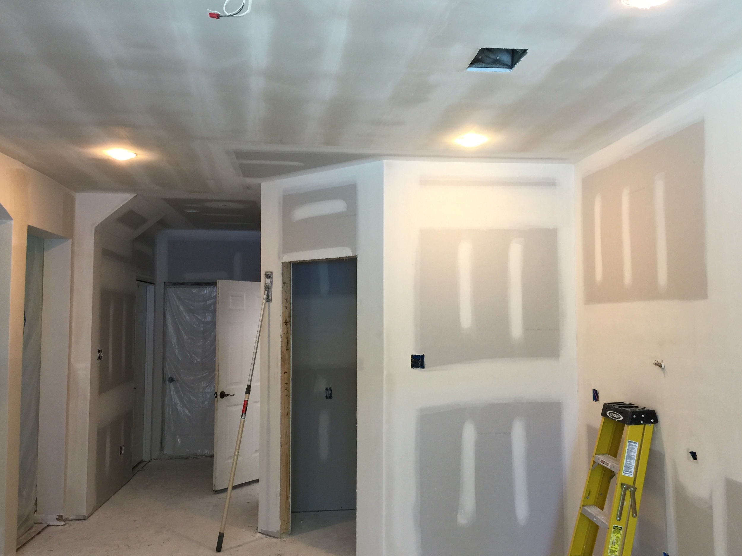
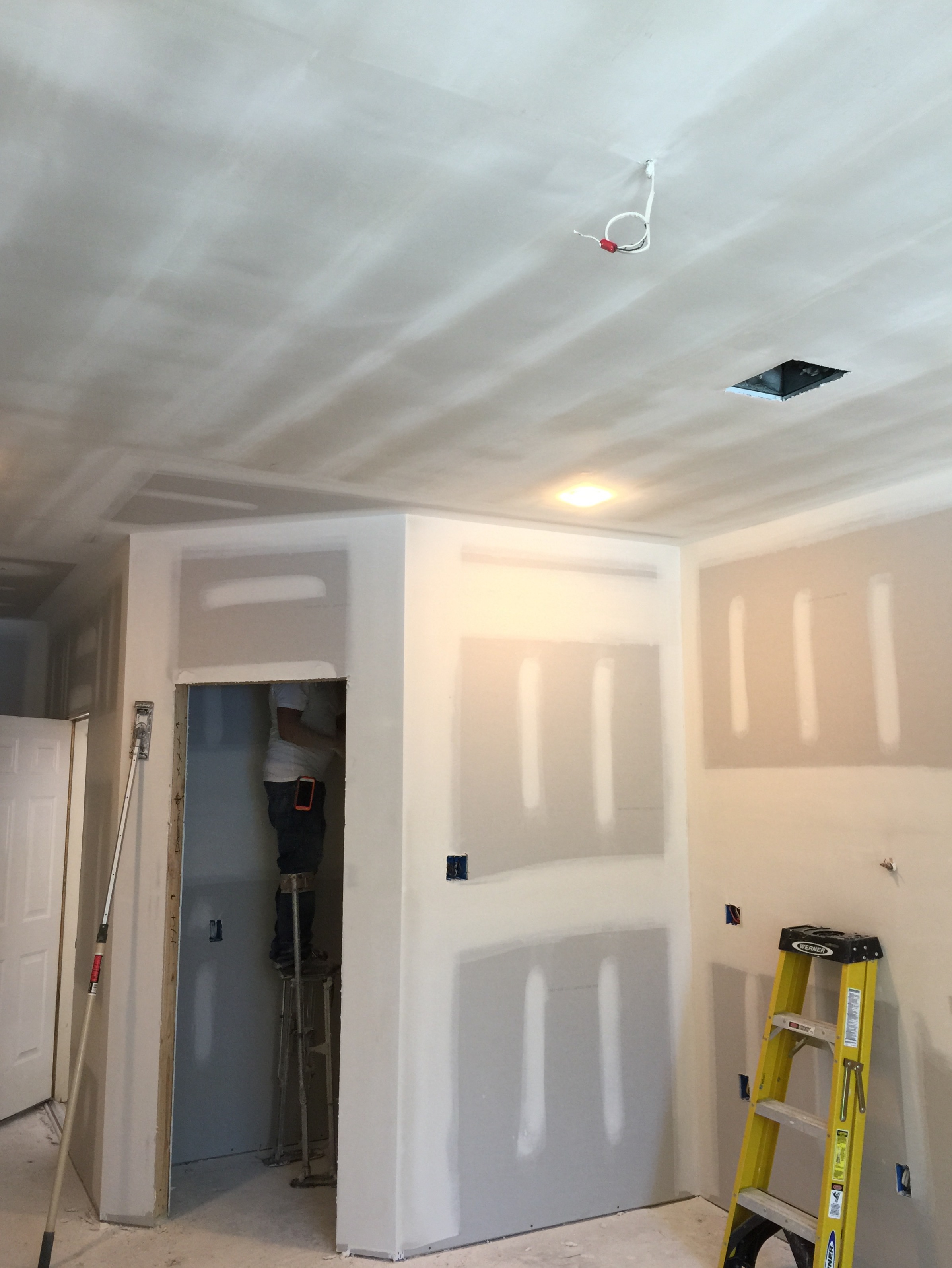
In my kitchen remodel that’s currently underway, I got rid of my sheetrock because of all this heavy texture (pictured above) I had on the walls of my kitchen.
Because I was super busy and not really ready for my own remodel, what with all the decisions needing to be made and such, I did a knee-jerk-reaction with my decision about what kind of texture to put back into the kitchen. I told my contractor to just match what we had in the adjacent spaces: a light rolled texture with a stomp on the ceiling. Do I love rolled texture? No.
Do I love stomp? Hell no.
But it did match the living room, which is quite open to the kitchen.
However, I do have a good place to transition my textures: on inside corners. The arched columns and deep openings between the kitchen and living room could get the rolled texture, and the simple, smooth walls and ceiling that I love now could occur in the kitchen, dying into the inside corners of those sheetrock columns.
So I changed my direction: I went smooth in the kitchen.
Now I’m soooooo happy. Ridiculously happy.
I have smooth walls and ceiling in a space that I am going to spend a lot of time in, a space that I will be in every day, a space that really matters to me.
I would have to pay for newly textured walls and ceiling anyway. Why pay for a mediocre look when I could pay a little bit more for stunning?
I put something I love into the space, regardless of what was adjacent or located elsewhere in the house. Luckily I had a perfect way to transition it where it made sense.
Bottom line....If you’re spending money on it, make it matter. Make it a significant improvement. Make it valuable. Make it count.


