I hope you enjoyed my post on sinks and faucets from KBIS, that I published last week. There were so many great new products, I wish there’d been more time to see even more vendors. I’m giving you the highlight reel here, this time it’s all about surfaces.
Tile, countertops, marker boards, peel-and-stick wood…...I’ve seen it all up close and personal and these products are amazing.
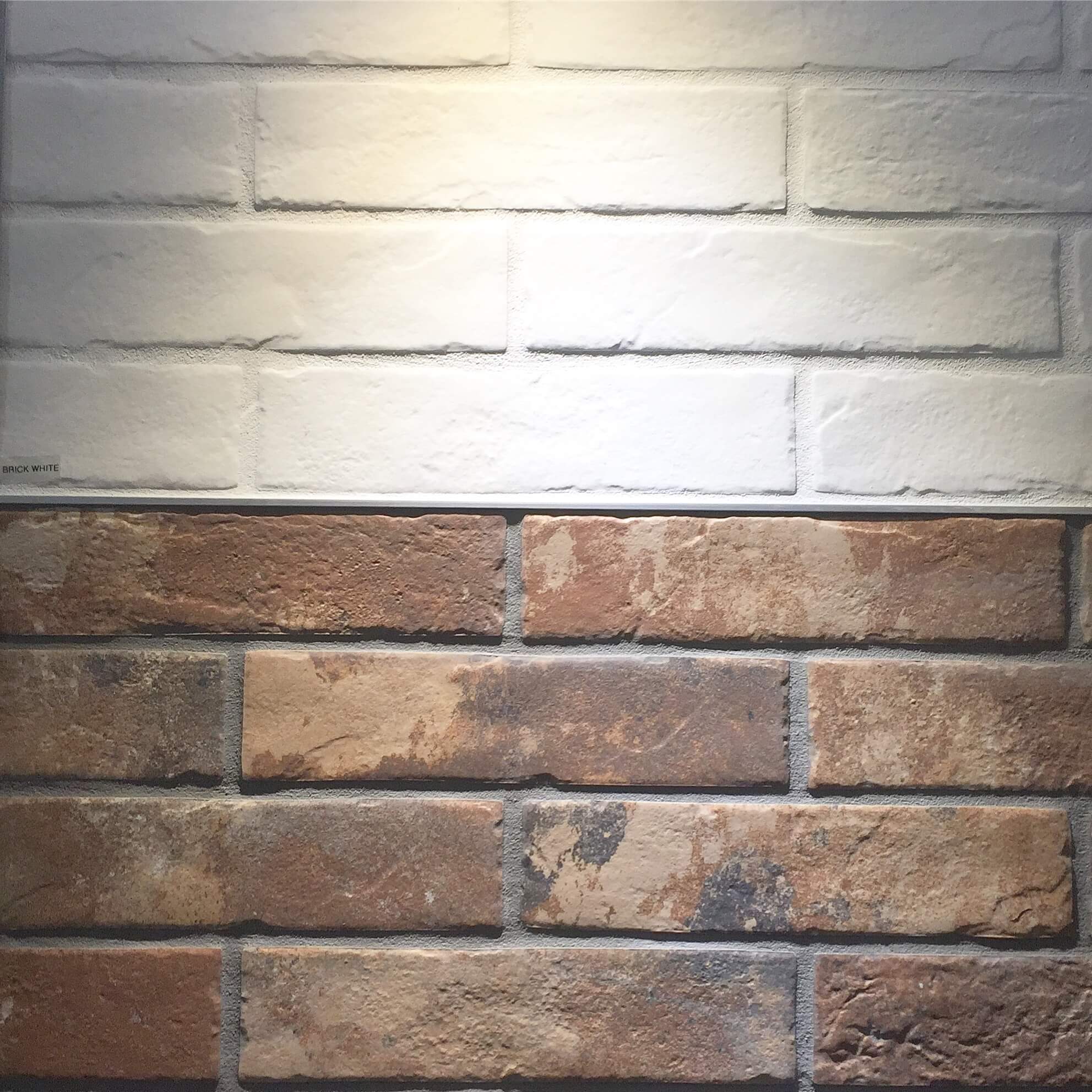
I think this image below got some of the most likes on my Instagram page of all the products I posted over there.
Tile Introductions at KBIS 2017
This is porcelain tile made to look like brick. We have porcelain tile that looks like wood flooring (okay, we have a little too much of that now….stop….please…..), so why not brick? This I can wholeheartedly get behind, as opposed to my love/hate relationship with wood-look tile.
This tile from Arizona Tile looks amazingly realistic. I love the white one best. It’s thin, like a typical tile, will wear like iron, is washable, and you can get your local tile installer to install it. You won’t have to hire a brick layer and use mortar that will absorb everything. It can be used on floors and walls. It debuted at the show and will be coming available in the spring, so hold off on your brick projects till then!
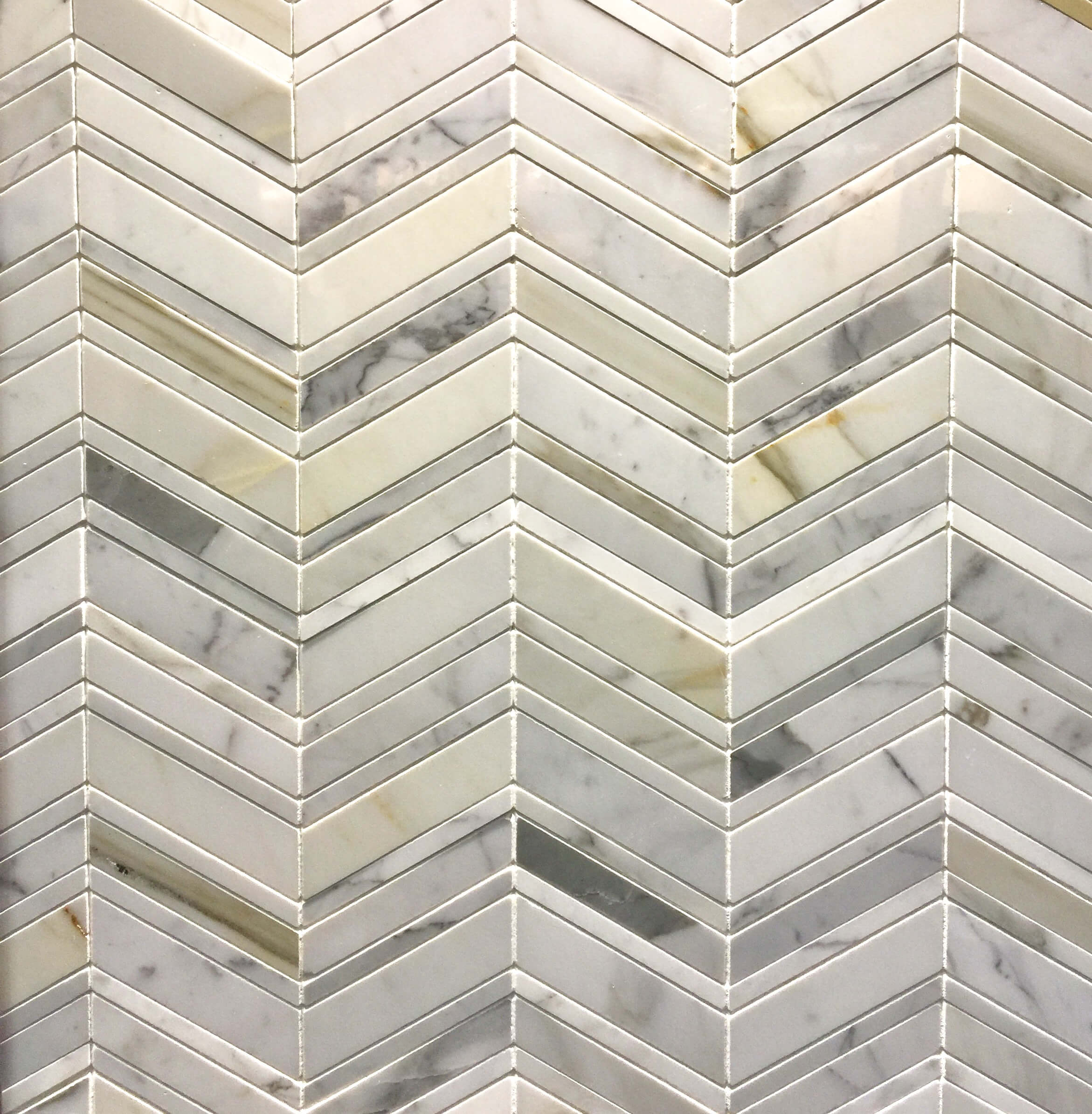
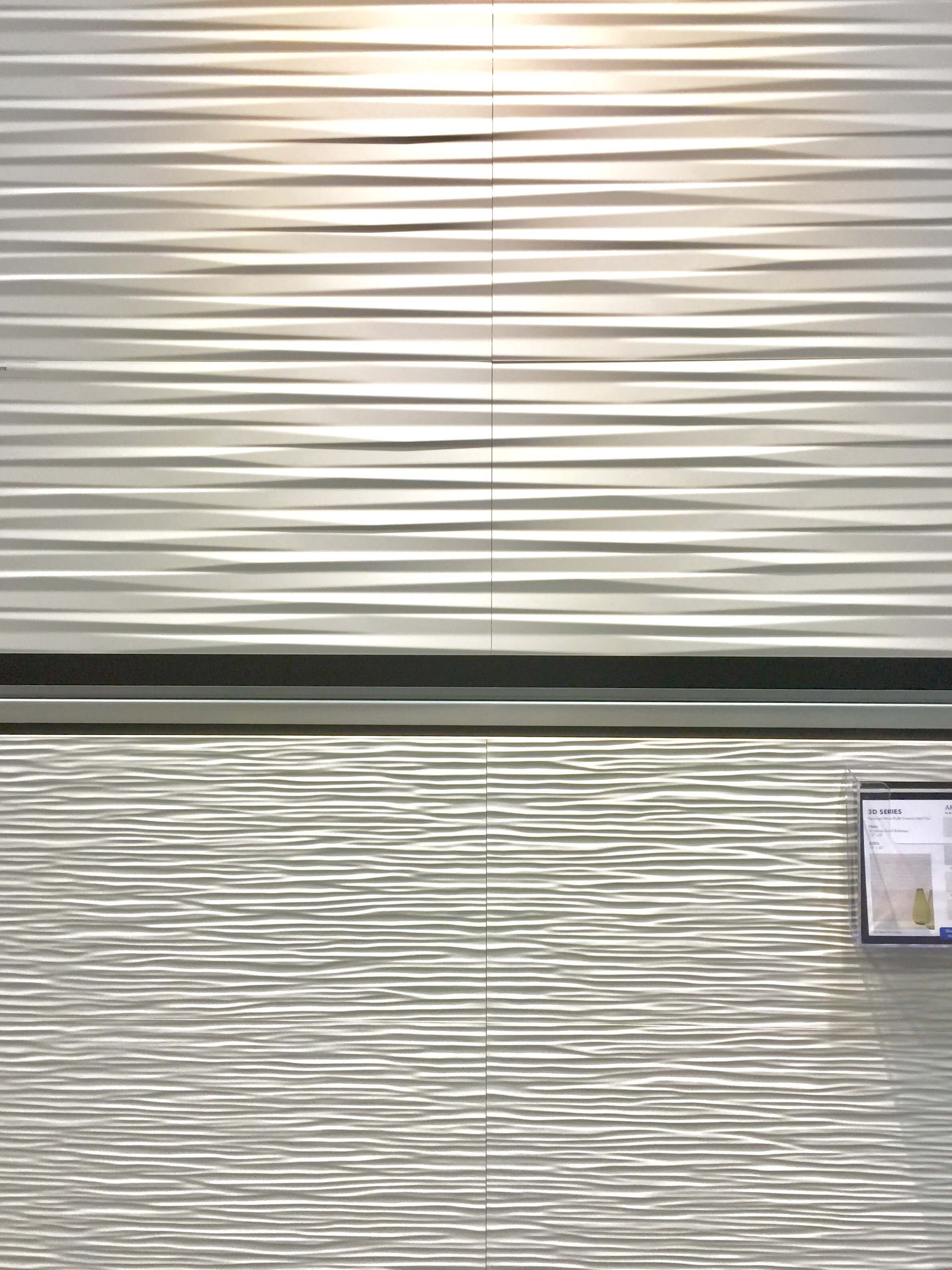
I also found this lovely chevron marble mosaic, shown below, at Arizona Tile. You just can’t lose when you install a classic. Then, a tile with a contemporary wave-like look called 3D. You'll see below, all the big tile vendors are thinking about relief and texture. They're developing tile with real depth.
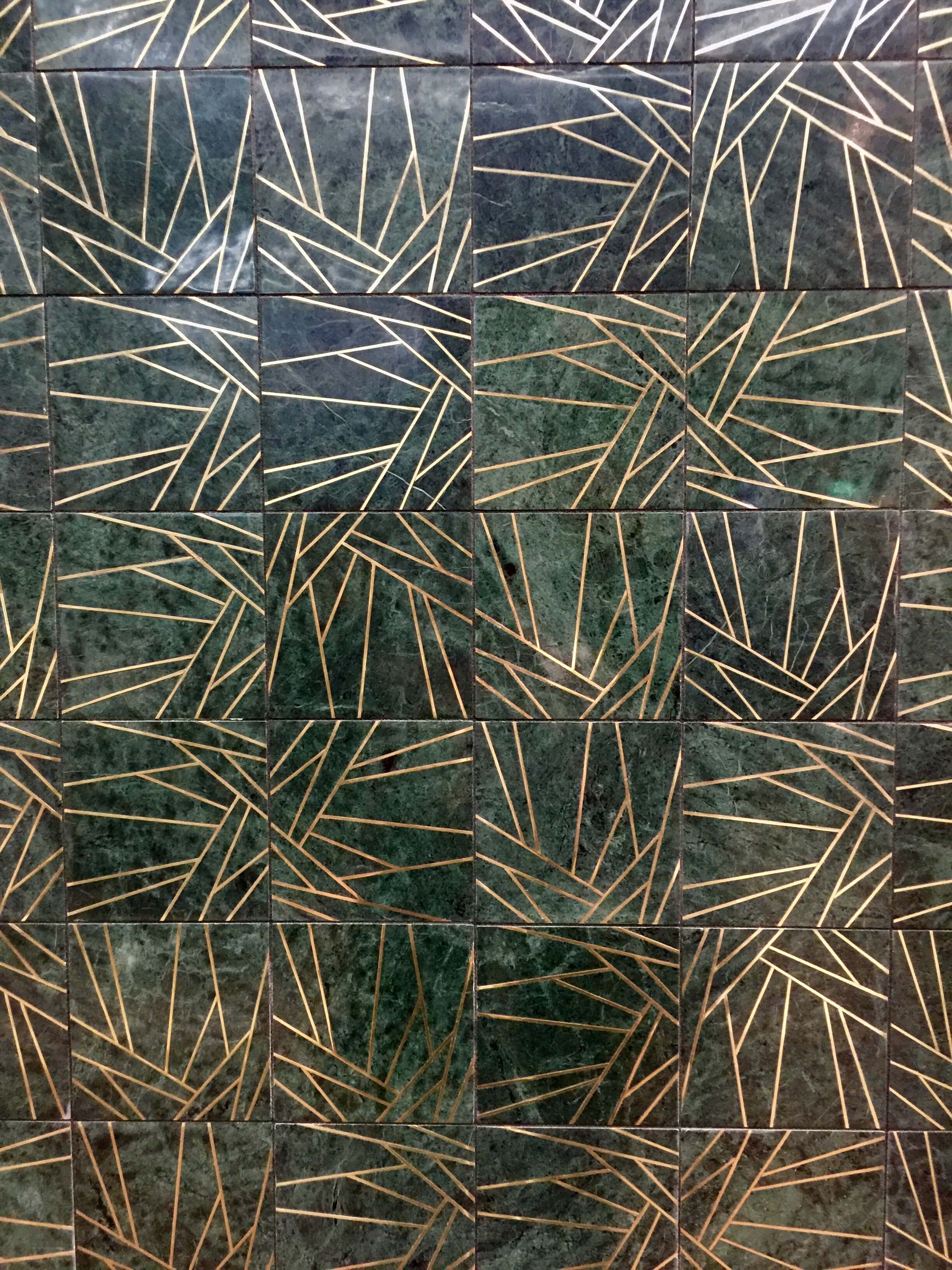
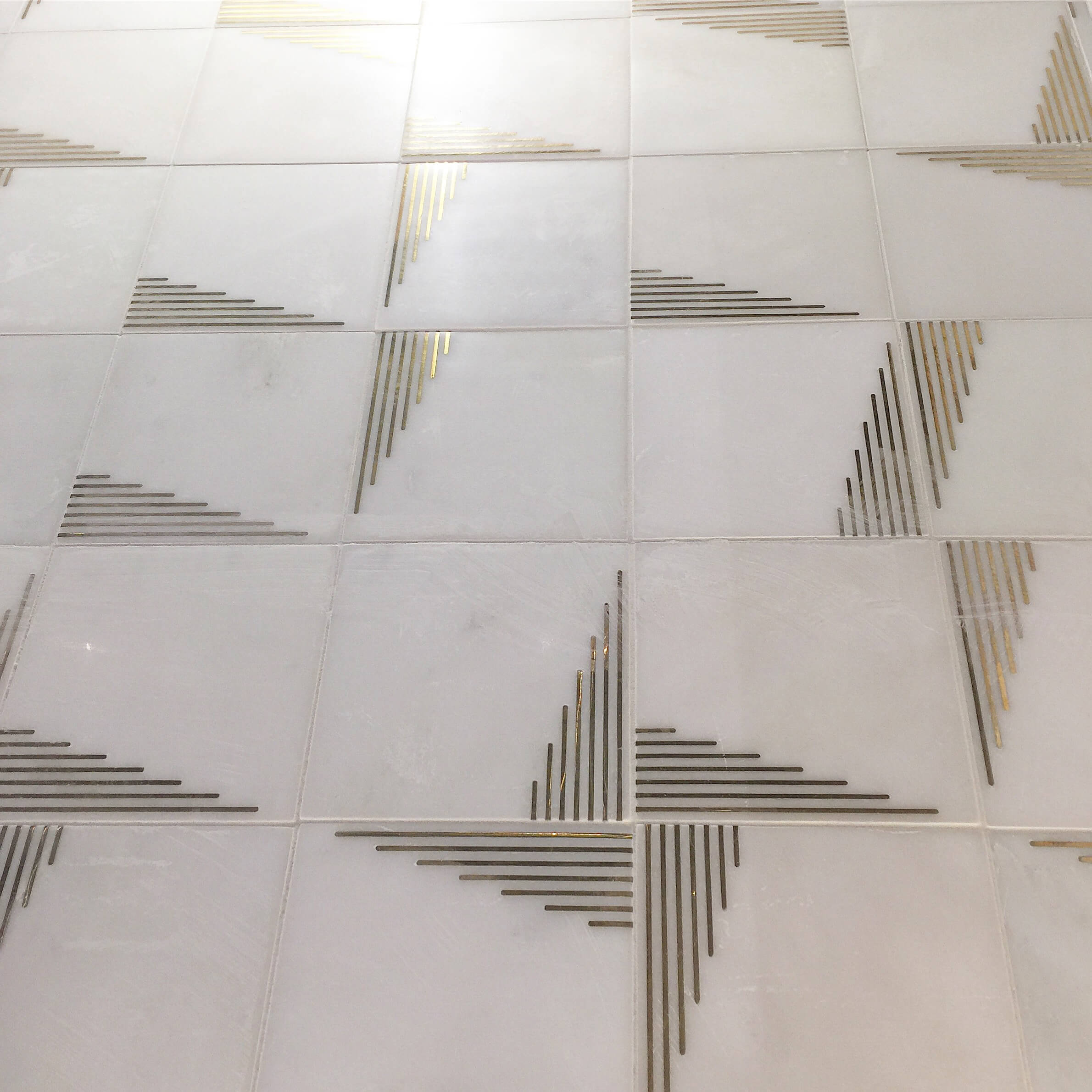
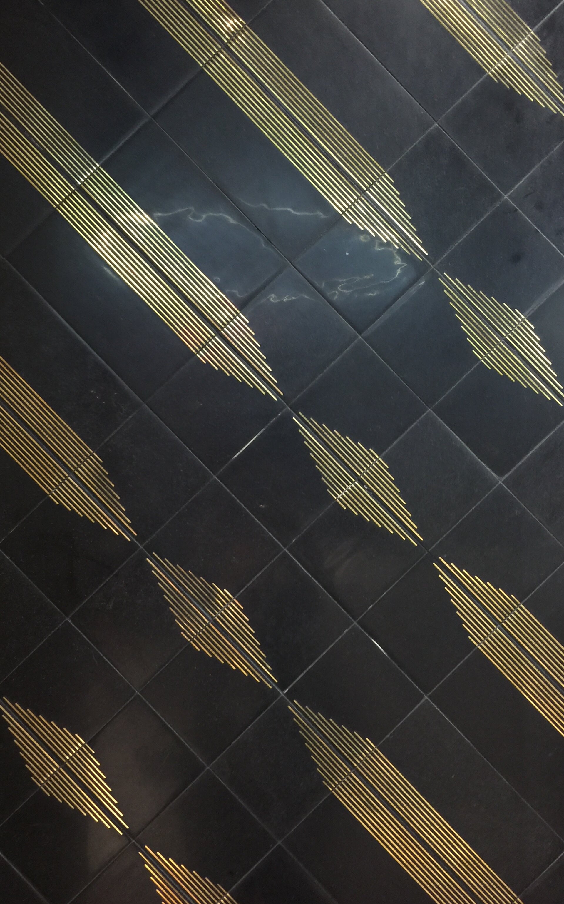
Ann Sacks always impresses with their high end finishes and unique combinations of materials for surfacing. I’m in “designer heaven” when I walk into their booth, just dreaming of the kind of projects I’d used these products on. This brass inlaid marble tile collection, Paire, was just stunning.
Ann Sacks Paire tile with marble and brass inlay
Yes, it’s really pricey, but it can be paired with the solid marble field tiles to water down the cost a bit while still having a super customized, and ultra luxurious look. Check out the interesting pattern created with the black marble and white marble versions.
These beautiful marble tiles from Ann Sacks are sold with or without the brass inlay and patterns can be developed turning the tiles in different directions.
Ann Sacks has done a lot of architectural type products in past years, and this year, they similarly created a concrete product with artist, Itai Bar-On. They covered their main walls with this product and lit it from behind. I found it so impactful. What a great backdrop for a corporate or hotel lobby reception area, wouldn’t you say? How about a tall stair wall in a loft space?
Want…...projects…..to…..use…...these……
At Walker Zanger, they went all in with pattern and texture too, creating these new tiles. See what I mean about depth and relief in tiles?
They expanded their 6th Avenue tile line, which I love and use often. This line has many shapes and colorways with even more now, to work with on any project. Check out a few of their new patterns below.
Countertops
Countertop selections these days are almost endless. I love going quartz because finding that just-perfect natural stone slab(s) for a job can be almost impossible. Quartz is dependable, looks the same from sample to slab, and with new intros into the market every day, you’re bound to find something you will love.
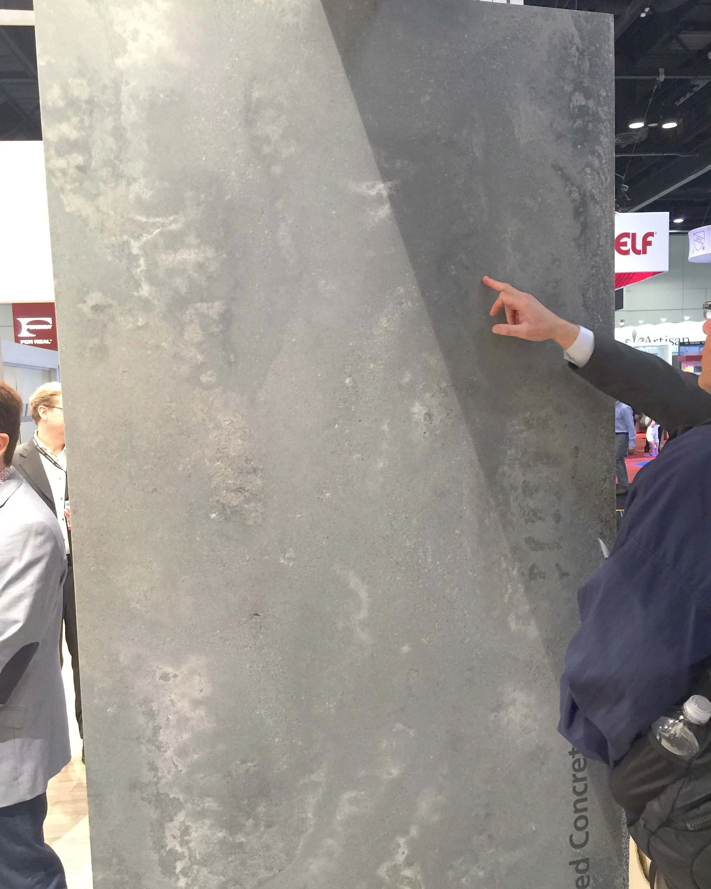
Caesarstone introduced this new concrete look slab at KBIS called Rugged Concrete. It came out that day, so I was excited to see it. I know too well the problems that concrete countertops have, cracking, staining, it never looks like the color sample, etc., so something that is so much more durable and predictable is a designer’s dream. Oh, and it looks beautiful too! They came out with more grays as well, to expand their line.
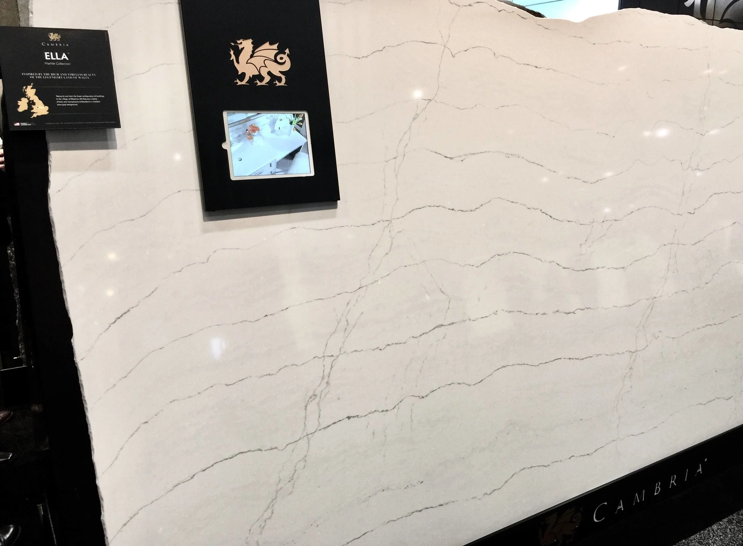
This slab from Cambria, Ella, shown below, was so light and pretty and looked just like a fine natural quartzite slab.
And this dramatic material below, Marquina, from Silestone by Cosentino was a real show stopper.
We hit the Stikwood house :-), and well, if you’re doing farmhouse style, you should really investigate their products. I love the plainer ones they introduced, the simple white plank and the warm wood that looks like teak.
When I saw the reclaimed wood product in this more modern installation last year, designed by Bobby Berk for Pardee Homes, I found it really gave these spaces some warmth, texture and drama. I especially love the reclaimed wood look combined with the more contemporary style that he put together in this showhome we saw in Vegas during last year's KBIS trip.
Stikwood shiplap reclaimed wood paneling | Designer: Bobby Berk
Stikwood shiplap reclaimed wood paneling | Designer: Bobby Berk
I stepped into the Formica booth to write on the walls. :-) Yes, their writeable Formica product is really appealing. It comes in some new patterns and is so much fun to use. I can see this installed on a large cabinet door in a kitchen or laundry room, a wall in a child’s bedroom or playroom, a home office (finally, a way to get organized) and even a table or countertop, like it was done here.
New patterns/colors of Formica writeable surfaces
I’ll be sharing yet another surface in my next KBIS post. Keeping that one under wraps till then.
Check out my previous post about sinks and faucets including some big trends that are charting the direction of kitchen design!
Walker Zanger bathroom tile vignette at KBIS 2017
Subscribe to my blog for interior design tips, advice, and inspiration designed to help you LOVE your home!


