We all know that paint can be used to trick the eye.
You can blend things together or visually separate them, simply by using a contrasting or matching color tone or value.
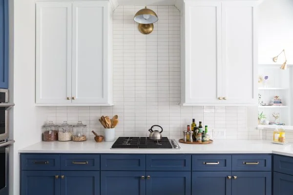
When I want a space to seem taller or more open, one trick I use in a kitchen is to blend the backsplash and upper cabinetry altogether in a light color. If you have only the countertop or the base cabinets as the contrast, the space will have much more height and feel less confined if things aren’t visually chopped up.
I worked on a kitchen remodel with a cottage / country style where I used that very trick.
When we started, the kitchen was much smaller — that’s why we decided to open it up to the adjacent living room.
The sink area, however, was still located at the window, kind of in the far corner of the kitchen. So, because I didn’t want that space to feel confined or tight in any way, I kept the upper cabinets and backsplash light, visually blending them together to make that space feel larger, taller, and more open.
See for yourself...
DESIGN TRICK - Two tone kitchen with white uppers blended to match backsplash | Designer: Carla Aston, Photographer: Miro Dvorscak
Let’s now take a look at some projects where blending the backsplash and the upper cabinets effectively raises a kitchen's ceiling, making the entire space feel taller, larger and more open than ever before! ;-)
Kitchens W/Upper Cabinets Blended with Backsplash
DESIGN TRICK - Two tone kitchen with white uppers blended to match backsplash | Designer: Carla Aston, Photographer: Miro Dvorscak
DESIGN TRICK - Kitchen with upper cabinets blended to match backsplash | Designer: Carla Aston, Photographer: Miro Dvorscak
DESIGN TRICK - Kitchen with upper cabinets blended to match backsplash | Designer: Carla Aston, Photographer: Colleen Scott


