

I finished up a project a few months ago and I’m excited to share a few images of it with you today!
This project was a bit unique, in that the homeowner wanted to go dark in her kitchen. She loved the idea of black countertops and didn’t care for the “white kitchen” look that’s so popular now.
Me, I’m all about customization, bespoke interiors, and your home's design reflecting your personal desires and needs.
That's why I was excited to go all dramatic here and give her what she wanted with a tasteful, sophisticated remodel that blended the good that she had in the space already with some new products and materials that spoke to her taste and achieved what she wanted to create.
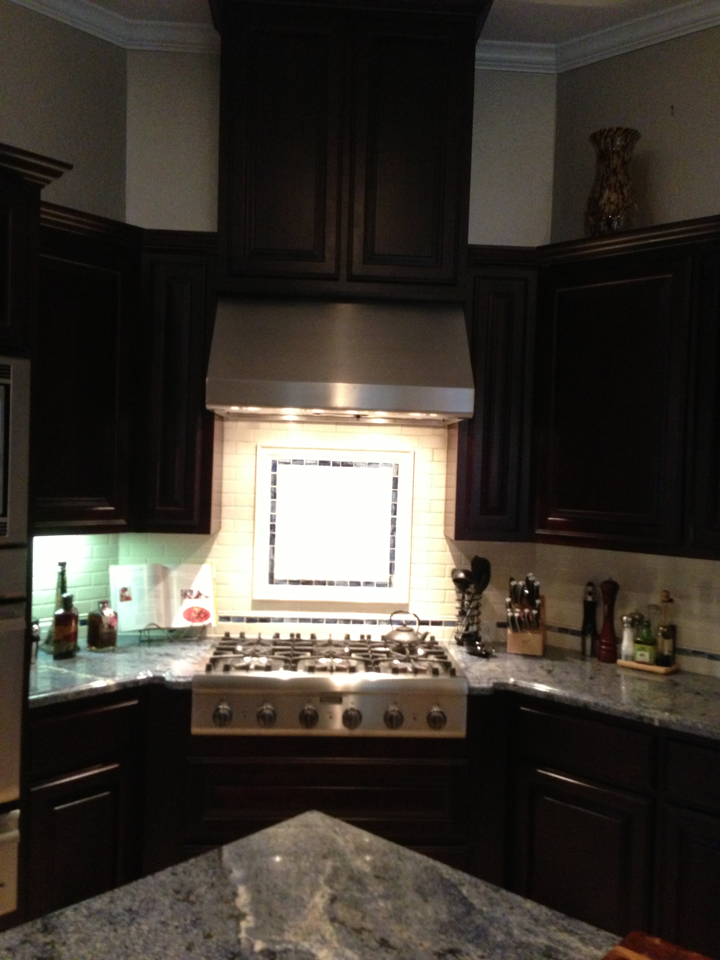
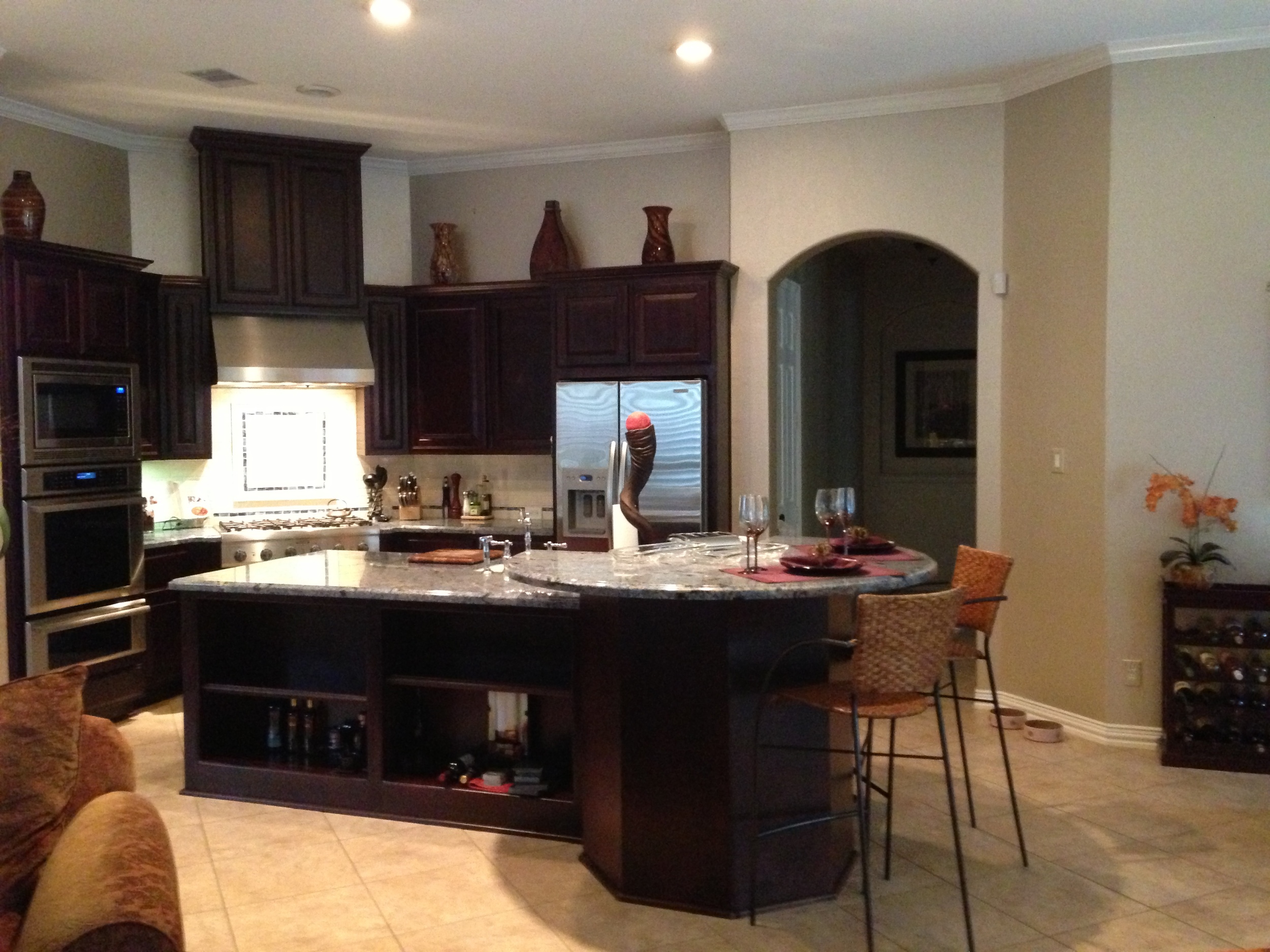
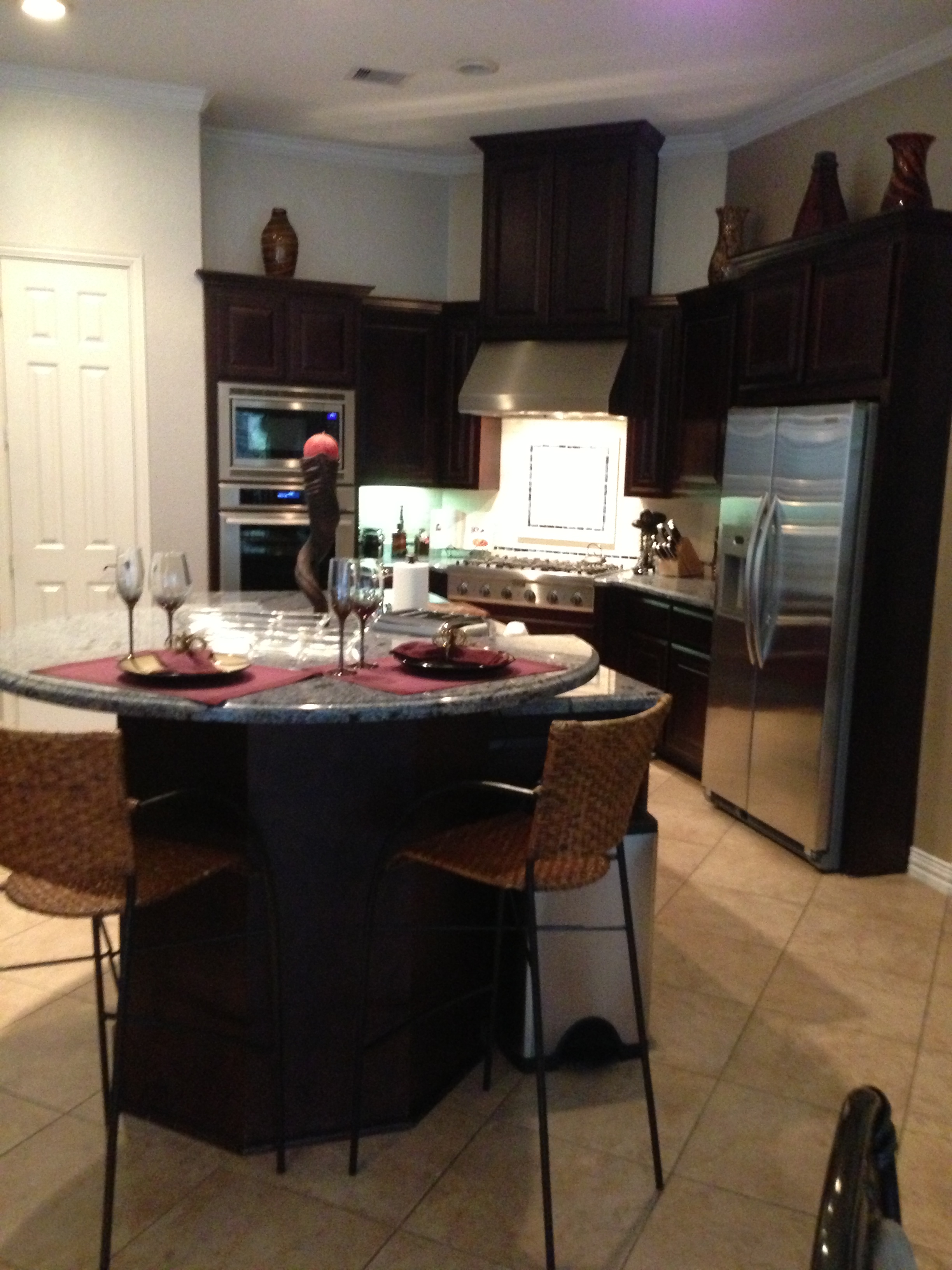
The problem areas:
The beige, builder basic tile floor: This space was all open to the adjacent living room that had a dark wood floor. We needed to blend the two together, not divide them with a high contrast between the two floor materials.
The island: That high, raised bar area at the end of the island was odd; and, well, you know how I feel about oddly shaped kitchen islands. She wanted a bar/seating area at the island that was at a lower height, and I wanted the “awkward” gone.
The finishes: The white and blue tile backsplash weren’t reflecting her style and taste. Frankly, with those dark cherry stained cabinets, it just didn’t work. Since we were keeping the back cabinetry wall, we needed to find a beautiful backsplash to work with the wood tone and the new black granite countertop.
Basic can lighting needed an upgrade: We all know beautiful lighting can be that perfect additional element of jewelry a space needs. In order for this space to look custom designed, we needed some distinction that new lighting would bring.
Color palette: The homeowner wanted to use plum or eggplant as an accent color in the adjacent living room. (Right on target with Pantone’s color of the year :-) We had a wall color that needed to stay, a taupe color, but that worked as a great neutral for the new finishes we layered in.
Our solutions:
The floor was a big deal here. The homeowner was afraid to go too dark because everyone had told her it would be dark. Well, that just so happened to be what she liked! I wanted to blend the new floor with the adjacent dark wood flooring so that there wasn’t such a high contrast, and the room would visually flow together better.
I chose a slate from Thorntree Slate and Marble. It adds some big movement for drama, gets the floor dark without going too dark, aaaaaaand it just so happens to have some shots of a gorgeous eggplant color in it: Lavender Harvest slate.
Perfect. ;-)
For drama, we used black Titanium granite for the counters in a polished finish.
Seen here is the slab we found at Arizona Tile. It has just enough movement to be exciting, but not so much that it distracts.
Walker Zanger’s Oceanside tile backsplash was the perfect way to lighten up the splash area a bit, reflect some light in there, and give some depth and richness to the kitchen. It combined the colors of the space perfectly, and added a perfect amount of drama.
While I love a white subway tile (here in this instance), this tile is exactly what we needed!
For lighting, we did a pendant from Rejuvenation, centered over the island. Glossy black with just a hint of brass for a little gleam and something unexpected.
The color palette was massaged to work with what we were doing within the adjacent space. The finishes all had to serve as a great backdrop for this rich, dramatic color scheme.
Click to enlarge full screen
That island had to go. Instead of modifying it, we built a new one and painted it black to match the granite. It now has a hidden trash drawer that the previous one didn’t. And, of course, there’s the seating situated directly across from the kitchen.
A much more direct and open feel, no?
The "afters"!
And here you are: the "after" shots of the finished kitchen! (Photographs by Tori Aston)
What do you think?
Personally, I think it turned out beautifully! And it speaks to the homeowner’s tastes and preferences for a stylish, sophisticated, dramatic, dark, and beautiful space!
