This is the first entry in a series of articles I’ll be sharing on living large in small spaces.
Each will examine and celebrate the ideas and concepts that make small spaces feel bigger.
The first small space we’ll examine and celebrate is…
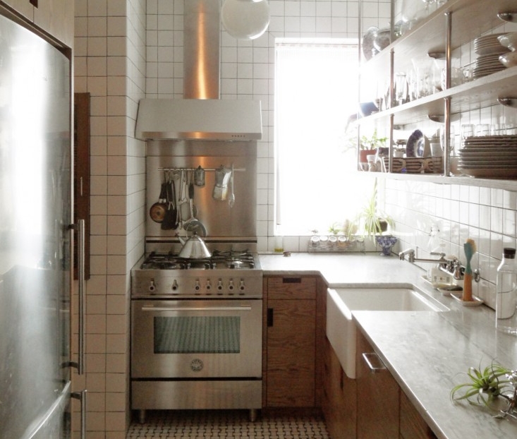
This small, enclosed kitchen in NYC (full-view available down below), measuring 7’ x 11’. Architect Lauren Wegel did a great job of making the space seem light, bright, and larger than it really is.
How can you do what she did so effectively in your home? Let's find out! ;-)
Utilize open shelving:
Because the uppers are open, open shelves can be installed right in front of the sink, and then closer to the window, all without blocking light. This results in there being MORE storage available than if there would have been a wall of upper cabinets. Also, if there were enclosed cabinets there, you would feel like the wall was 12” closer to your head.
Oftentimes, people will want built-in storage in small spaces. That’s when I have to remind them that they’re merely shrinking the space visually by the depth of the cabinetry in the room.
ARCHITECT: Lauren Wegel
IMG SOURCE: Remodelista.com
Reflective surfaces make a space seem bigger:
See how the light skims the tile all the way down the wall? It’s the gloss that’s reflecting light into the space and giving it a more open feel.
Running finishes to the ceiling makes a space feel taller:
I love how the tile wasn’t stopped at a lower height.
I preached about this concept in this article about making small bathrooms seem bigger.
ARCHITECT: Lauren Wegel
IMG SOURCE: Remodelista.com
Use niche spaces for storage:
Sometimes it’s tough to discover where available space is at by eye-balling an area as is. That’s why, oftentimes, I’ll wait for the job’s demolition to clear the area out so I can better spot where niches or pockets of space are at. For instance… I found an 18” wide niche in my upstairs bathroom remodel (click here to view), so we built a little linen cabinet there. It provided just enough storage so that we could do a more open vanity in there. (Another space growing feature.) I love how Lauren used the old dumbwaiter as dish storage!
Stay tuned for more articles on #smallspacesolutions!
And to make sure you never miss one, click HERE to subscribe to my newsletter, DESIGN REFRESH. ;-)
*Permission to publish this article and images was received from the designer/architect.

