Bathroom Remodel Progress

We are making progress on this master bath remodel and I'm so pleased with how it's turning out! The limestone tile is in and I love the natural texture and random variation on the floor.


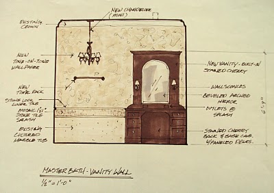
Here is my design sketch and how it will look when finished. A short wall was constructed along the back for wall mount plumbing and a ledge for bathing items. Limestone tile wraps up the short wall from the floor and a limestone counter will be installed this week on the ledge. A smooth, creamy soft wall surface with all mouldings same color as the wall will envelope the space and in the middle of all this will sit a gorgeous solid surface soaking tub.


Beautiful, creamy white smooth tub to sit on top of all that texture. It's a subtle difference in textures that is the key design element throughout this house and in the bathroom.


Here's what we started with! It had good bones....a lovely arched ceiling, nice window, ample space, etc., it just had some bad applied details. The columns that support nothing, the mauve pink walls paired with a yellowed cultured marble tub surround, and the chunky applied moulding destroyed the space. Very bland and just....wrong.


Demo....yea! Get that stuff out of there!


Short wall is built, plumbing stubbed in, walls primed, tile begun. You can see the feel of the room changing. The ceiling feels higher with no moulding and the curve of the ceiling really softens the room and envelopes the space.


Here we are today. Can't wait for the limestone counter to arrive and then paint. House Beautiful here I come! :)


Discussion Continued...

Redo Simply

I recently finished this remodel where the homeowner wanted an update in her kitchen and family room. This is a typical remodel request in this area, new countertops, appliances, paint, backsplash, lighting, hardware at a minimal cost but with a big impact. I think we hit the nail on the head with a dramatic change and a more sophisticated look within the confines of the budget. After photo above.

Here's the before photo. The older white appliances had to go as did the tile backsplash and counters. We kept the existing cabinets and stained them and kept the tile floor. The homeowners wanted a darker, cherry stained finish for their cabinetry for a richer look.

The photo above was their existing fireplace wall, directly across from the kitchen. I thought it was just too busy and appeared as a sort of quad diagram, everything divided up in sections, with too many colors and finishes. Something needed to stand out and become a focal point, the fireplace!


Here is the after photo, much neater, tidier, and visually cleaned up. The fireplace has more prominence and the room appears cozy and comfortable. The built-in on the right of the fp was minimized with paint to match the wall with only shelving that contrasts. The long mantel that divided the wall in half was eliminated and a proper mantel stained to match the kitchen was installed. Tile surrounding the fp was changed out to a granite tile that matched the mantel in color. The tv was mounted above the fp instead of pushed back into the far corner as before. We reupholstered the existing seating and did a new textural rug to further enhance the rich look.


I love simplifying spaces so that beautiful features can then be noticed. Visual clutter and too many colors and accessories just create busy, uncomfortable environments. If you unite different features in a room with color or finish, you can make them bolder and more striking. I love how this project turned out, a much calmer and more sophisticated space.

Fabric on the chairs from Duralee, rug through Aston Design Studio. Granite is Crema Bordeaux from Arizona Tile, tile from Daltile, paint is Sherwin Williams, Latte. Photography by Cathi Taraboi Photography.

Discussion Continued...

My Building Lobby is Complete!


The furnishings I had custom made for my building lobby are installed and I think they look beautiful! Everyone in the building has commented favorably and I love that I can put my cards out there. Since this is right outside my studio door, I felt I should have a presence. The furniture piece below was placed there first by my landlord........


Well, I had to get involved! I didn't want my clients to think I had done that. (Sorry if I'm offending my landlord! I love it here! :))


My carpenter built the console to my specifications, then my faux finisher did a lovely job finishing it for me. The lamp is from Aidan Gray and the mirror, I had made up at my framer's studio. It reflects the light from the window directly across the lobby.


This is definitely more "Aston Design Studio".


Discussion Continued...