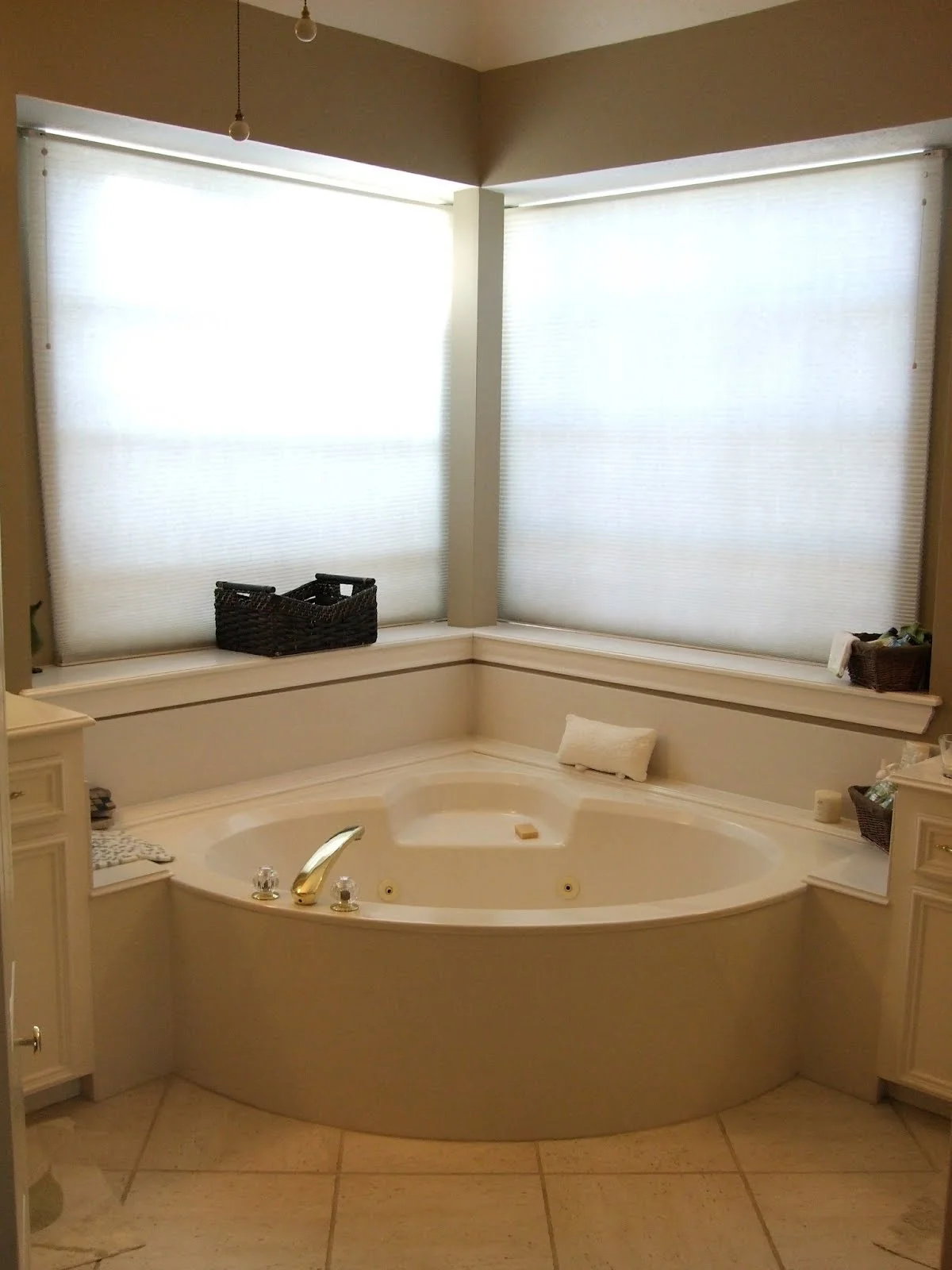
a matured bath is modernized
Click above images to enlarge / Press ESC to exit
This bathroom was designed for a young, professional couple, expecting their first child. She had a more modern style and wanted a luxurious retreat with a new tub and a spa-like ambience. Her husband wanted a slightly larger shower, a wider door to the closet and . . .
To make his wife happy.
Smart man, huh? ;-)
Click above images to enlarge / Press ESC to exit
Pre-Design Pictures
By clicking the images to the left, you can enlarge the pictures and see how this bathroom was just worn out. There was a panel missing in the shower, so they were unable to use it. The storage wasn’t very effective, and it felt small and cramped.
The homeowner wanted something uplifting and fresh...
Something young and sophisticated...
Something modern that you'd expect to see in a boutique hotel suite.
I couldn't wait to get started.
The Floor Plan
Designer: Carla Aston / Photography By: Miro Dvorscak
Using Linear Shapes
One item she wanted to try was a rectangular corner bathtub, because she had always disliked the rounded shape of her previous one. On plan, it laid out beautifully and made the bath feel more spacious.
As you saw on the floor plan, I chose a rectangular tile that was run in a straight pattern to repeat the shape of the tub and give her the modern look she desired. It was really important for the tile to line up everywhere, so it flowed without visual interruption over the tub and up the walls, thus expanding the space.
That rectangular shape translated to horizontal lines and banding on the walls. The linear pattern in the tile is repeated in the tight grain of the rift cut oak, run horizontally on the cabinets. More horizontal lines are used in the linear quality of the plumbing fixtures, the cabinet pulls, the Roman shades, and the showstopper: the mosaic tile.
Designer: Carla Aston / Photography By: Miro Dvorscak
The Mosaic
I used it up at eye level as a band around the room and topped it with linear sconces that would add some sparkle at the mirrors. When I made my initial design presentation, it was the homeowner’s favorite feature. Don't you think It does a great job of bringing the room together?
The cabinets seem to float off the floor with the tile base below. Recessed lighting at the base provides a great night light for the homeowner and further elevates those floating vanities in the evening, ultimately contributing to the light, spacious feel we were after.
I love how the tile grout lines all align. No mean feat, trust me.
Details All Aligned
I was very stubborn about how the shampoo niches were to be placed They had to be perfectly centered, vertically, in the band with whole 1” x 1” tiles above and below the niche.
Don’t you think that paid off?
What a sweet detail :-)
Designer: Carla Aston / Photography By: Miro Dvorscak
Designer: Carla Aston / Photography By: Miro Dvorscak
A Niche For A Basket?
We built that little tiled niche for a basket of bath goodies, but their first baby loves it in there. (Do you see their little pooch peeking out? She's SO cute!. :- ) They said they can’t bring themselves to put the basket back because she loves that spot so much.
I’ve designed for cats, so I might as well design for dogs too!
Designer: Carla Aston, Photography By: Miro Dvorscak
Modern Materials
Here we used a solid surface material for the countertop by Viaterra. It gives the space a modern feel with its lack of texture and veining.
In my opinion, the mosaic is the star here. Everything else takes a back seat.
Let’s see . . . I was charged with modern, sophisticated, spa-like, fresh, luxurious . .
I think this end result fits the bill!
As I look back through this tour, I see all my smiley faces. :-) I guess this project just makes me smile! I can't help but love how this little jewel of a bathroom turned out.


