Guest Bathroom Reveal and a Thank You

I just love how this little bathroom remodel turned out.  This is a guest bathroom that is also used as a powder bath, so it needs to look beautiful for guests whether they are staying overnight or not. 


Before photos below.


It was okay, but it could be so much better.


We started with the creamy yellow wall color used throughout the home to inspire the finishes.  I found this lovely wallpaper that is the real feature in this bathroom.  Gray with some yellow and a watercolor effect.


from Seabrook Wallcoverings


From there, the antiqued 6 x 6 slate tiles for the floor from Thorntree in Houston. They have the perfect shadings of greige and the brushed finish feels great underfoot. 

Avalon slate in a brushed finish


Then came the beautiful white onyx for the counter and splash. 


love that white onyx, sort of greige with yellow veining

The new tub is a deep soaker, selected by the homeowner.  It fits well in this compact space.  We did it in the biscuit finish which related in color to the onyx.
Biscuit subway tile for the bathing surround.  I didn't want to use the slate for this, it would've been too dark and masculine and would've made the tub stand out as bright white.  As it is it blends in with the tub and makes a nice bathing alcove.


biscuit subway tiles from Daltile


Pretty paint colors that bring out the color in the wallpaper and the onyx,

brushed nickel fixtures and hardware in a simple design so as not to take away from the wallpaper.

A mirror in a special finish,

a custom shower curtain to fit the space perfectly with an end to end curtain rod mount in a finish that relates to the mirror frame. 

There are so many different elements that go into pulling a small space like this together.


You know, it's all in the details.


After photo by Miro Dvorscak


I just want to express my thanks to some websites and blogs that have recently featured my work. 


Thank you for the mentions!


Participating in Wow Us Wednesdays at Savvy Southern Style

Discussion Continued...

Dining Room Update...After the Party

This client had wanted an update in her dining room for a long time, but with minimal major purchases.  No new table, chairs, or chandelier (she did the chandelier a few years before). It had been decorated by the previous homeowner, very tan colored, and that definitely did not reflect her style and personality. She did not want to paint or refinish the traditional furniture, but she had been talking about fresh wall color and window treatments for a looooong time. 

So long in fact, that one night at dinner, her friends grew tired of waiting for her to tear down that dated border and took things into their own hands


Flamestitch - remember that??


Well, ahem....a little wine was involved. 

This client is a friend of mine and we had done her kitchen some six years before.  She collects all kinds of pottery and glass.  She loves color and wanted a more youthful look while keeping the traditional furniture that she had used through the years. We started with a plan

Textural rug, large scale pattern, juicy color and some of her gorgeous glass on the table.


Much more fun!


 After images by Miro Dvorscak

Discussion Continued...

When Scale Doesn't Matter

There are some rules to decorating, but if you peruse the high end magazines and projects of top notch designers working these days, you soon realize that rules are often disregarded.  Whether it's done for personal taste, dramatic impact, or simply to do something unique, rules in decorating are often made to be broken.  This is when decorating becomes art and in the hands of a real designer, it has incredible results.

Scale is one of those elements that can be toyed with to create real drama.  A large object in a small space or a small object in a large space can really command your eye and focus your attention.  If you want a relaxed, peaceful, calm interior, scaling something to fit the space is very appropriate.  However, if you want some drama or to create a really personal, artistic statement, try over or under scaling an object of importance in a space.

Dick Bories and Jim Shearron - Elle Decor

Doesn't that small, beautifully carved clock command attention in the vast expanse of all that white?

Patrick Printy - Elle Decor

The justaposition of the hefty brass candlestick on top of the tiny table arouses curiosity.

Susan Ferrier - House Beautiful

Is there any doubt that it's all about the chandelier?

Barry Dixon - House Beautiful

The large mirror makes a grand gesture. By comparison, the sconces are dwarfed, making the space seem even grander.

Steven Gambrel - Elle Decor

The vintage Italian light fixture is small in scale with the rest of the room.  That scale dynamic emphasizes it's importance.

Jim Hodgins - House Beautiful

That piece of art above, reaching from sconce to sconce and from the ceiling down past the top of the sofa creates a strong visual in this room and commands your attention.  Don't you feel you're in the presence of a real masterpiece?

Steven Gambrel - Elle Decor

What a strong, architectural presence the overscaled dentil moulding gives this room 

Amilee Wendt - ASID Showhouse 2011

I loved this light fixture Amilee Wendt chose for the study in the showhouse I was in last spring.  It was such a bold statement.

Jay Griffith - House Beautiful

Veranda

I love how dramatic this little lamp and table looks in the tall niche one would typically want to fill with art or stuff.

Anytime you break the rules, you must be careful it doesn't look like a mistake.  In the hands of masterful designers, breaking the rules can become art.

Discussion Continued...

Outlet Shopping and a College Apt.


I went outlet shopping this weekend, looking for some miscellaneous items for photo shoots and a new rug for my daughter's college apartment.  She goes to school in the hill country area of Texas and the San Marcos outlet mall is a rather famous destination.  Shoppers from all over head there for some real deals.  One of the best stores there is the Pottery Barn Outlet, full of furniture and home goods from their stores, PB,  PB Kids, William Sonoma, and West Elm.  You can't go there with anything too particular in mind because you never know what you will find.  Crate and Barrel and Restoration Hardware are there too, but RH's goods always seem to be heavily damaged.  It sort of turns you off from the products there.  Crate and Barrel is more dishes, storage, and misc., not much furniture. 

I scooped up these items for some upcoming photo shoots.


There's always lots of great baskets.


A couple of French chairs for $299 ea.


Zebra printed cowhide rug for $399.


Cashmere throw for $79.  Tangerine Tango???  I had to really resist this one!


Then after digging through the stacks of rugs rolled up in the back, I found this one.


Perfect color and size from West Elm....for $150! 


It looks great in my daughter's apartment, filled with the furnishings from my Showhouse I did last April.  It was a mix of high and low, old and new, in some bright fun colors with a white envelope.  Click HERE for more about some of the specific items. I knew it would transfer well to my daughter so I designed it with her in mind.


The Ikea sofa and vintage coffee table were purchased for the apartment, the rest came from the Showhouse.  Doesn't the rug look great?  We're looking for a deal on a parson's style coffee table.  She gives her furniture lots of abuse so I'm looking for something very durable.  I'm thinking of having it made in laminate!


Her apartment, like most, is completely devoid of color and personality.  The rug really gives it some life.


She has some shelving built-in, but no room for a tv.  We did an Ikea tv stand, kind of matches the built-ins.  She has some of her art projects displayed.  The wicker chair was used on the balcony in my showhouse room.  I bought it at market in Dallas last year.


The desk is actually an old Ikea pine table that my son used in his college apt.  I had it painted and had a glass top cut so she could use it for a desk or a table if she wanted.

(Another art project on the desk!)


The table before.  It actually cost me more to paint it than the table was itself, but then it wouldn't have had the perfect color, would it?


She used the art I had for the Showhouse room all over her apartment.  The three vintage fashion ads in their Target frames look great there on the wall to the bedroom.  We amped up some storage in her little kitchen with a Target storage cart.  Gee that was tedious to put together. She did it all herself.


She was able to use the dresser and tackboard in the bedroom.


The bed and leaning mirror all worked in the bedroom.  A turquoise paint color on two walls would be great in here.  If she stays in the apt. next year, she might do it.  She would have to paint it back when she left.


We changed from the white duvet cover to a subtle pattern for this apartment.  It is easier for her to keep it looking nice.  She loves the bed!


The bed, furniture painting (I took the wood pieces to a professional finisher), and custom pillows were the "high" part of the project. Everything else was from Ikea, Target, outlet stores, flea markets and antique shops. Now if I can just see the rug when I go back to visit, underneath the clothes and art projects!


Linking to:

Simply Klassic Sundays

Metamorphosis Mondays at Between Naps on the Porch

Discussion Continued...

Pick Something

Some of the most successful interiors are developed by selecting one major element in a space and making it the star.  Everything else in the room plays a supporting role, remaining visually quiet. Like a choir with a soloist, a cast of actors in a movie with it's lead character, or a ballet troupe with a prima ballerina, not everyone or everything can shine all at once.  The more quiet the supporting parts, the more dramatic the outcome will be.

Ceiling - no showstopping, sculptural furnishings or colorful fabrics here....just that amazing ceiling.

Color - so rich you want to just wrap yourself up in it.

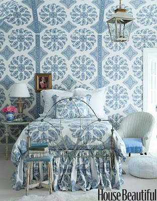
Pattern - the bed is almost non-existent, everything else plain.

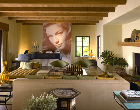
Art - so dramatic, nothing else competes.

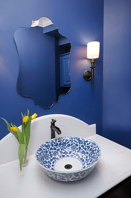
Vessel sink - with support from vanity top and walls.

Wall finish - the banquette is so neutral and unassuming by comparison.

Marble - details and cabinetry are all so simple.

Wallpaper - nothing else pretends to compete.

Sometimes it's best not to overwork everything in a space.  Let one thing stand alone and appreciate the plain-ness of the rest.

Discussion Continued...